Designing an OKR Module for an HR App to Replace Manual Workflows
One of the telecommunications companies in Indonesia needed an OKR software to help its 24,000+ employees create and manage their Objectives and Key Results. Previously done manually through Excel files, this OKR module complements the company's existing internal HR application. I worked closely with project managers, stakeholders, and engineers to research and design the end-to-end OKR experience — from creating objectives, monitoring progress, nudging colleagues, delegating access, to handling handover approvals.
A telecom company wanted to replace their Excel-based OKR process with a purpose-built module inside their existing HR app.
The initial kickoff meeting brought together the project manager, stakeholders, and me as the designer. The client explained that their existing workflow relied entirely on Excel files — employees would manually create, track, and share OKRs each quarter. They wanted to move this into their HR application and already had some early designs for a “create new OKR” page. My job was to improve those designs and design the remaining features sprint by sprint, following the company’s two-week sprint schedule.
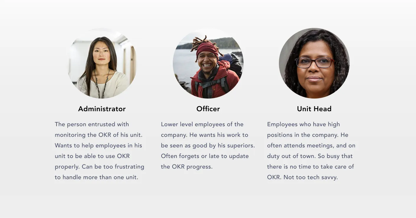
With 24,000+ employees across Indonesia, three distinct personas drive the OKR experience.
From early discussions with stakeholders, we identified three types of users who would interact with the OKR software in fundamentally different ways.
Four core workflows emerged from stakeholder interviews and HR team discussions.
Managing OKR
Employees need to create, edit, and update their own objectives and key results throughout the quarter.
Monitoring OKR
OKR Champions need to monitor all OKRs within their unit so they can identify blockers and keep progress on track.
Employer Approval
Unit Heads need to review and approve OKR submissions, progress updates, and handover requests from their reports.
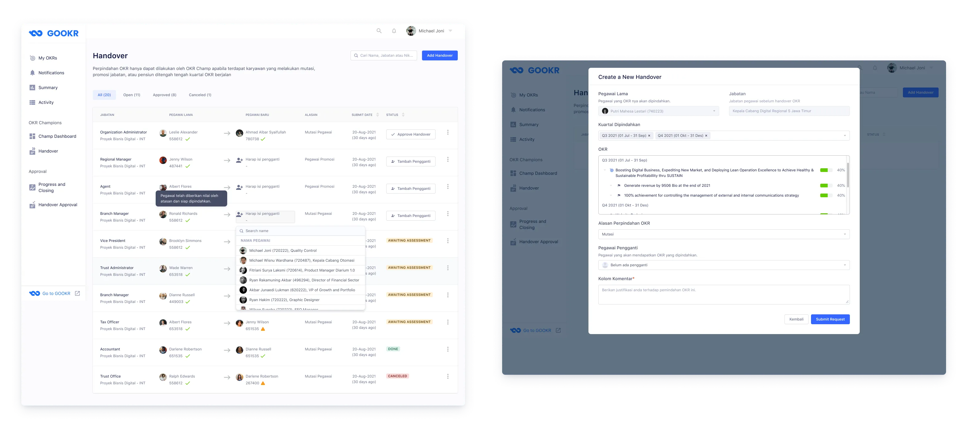
Handover OKR
When employees change positions, their OKRs must be transferred to a replacement employee with full context preserved.
Stakeholder interviews, competitive analysis, and usability testing shaped the design direction.
Stakeholder Interviews
I conducted interviews with the project manager and the HR team throughout sprint planning sessions. From the project manager I gathered requirements and identified priority problems. From HR I got insights about how employees actually used OKR in their day-to-day work — including the friction points they observed when managing the Excel-based process.
Competitive Analysis
Before designing, I studied existing OKR tools to understand how established products handled common patterns — creating objectives, tracking key results, and managing team-wide OKR views. This helped me identify conventions that users would already be familiar with, and surface patterns worth adapting for an enterprise HR context.
Usability Testing
For selected features I ran usability testing with colleagues who work at the company using Maze, followed by interview sessions to dig into the findings. The client also conducted internal usability testing with employees, and I incorporated that feedback into subsequent iterations.
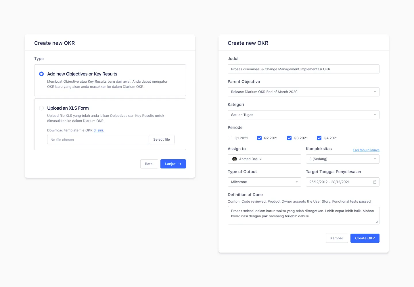
The existing form design pushed users toward Excel uploads instead of direct web input.
Problem
In the existing design, the Excel upload section was placed at the top of the page. Research showed this placement caused employees to believe uploading an Excel file was the required method — many didn't realize they could add objectives and key results directly on the web. Stakeholders wanted to reduce Excel dependency and encourage employees to input OKR data natively.
Solution
I redesigned the input as a modal popup with two clear options: add from scratch or upload an Excel file. The direct input option is positioned first, making it the obvious primary action. Users who still want to upload can do so, but it’s no longer the default path employees fall into by default.
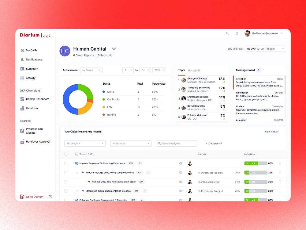
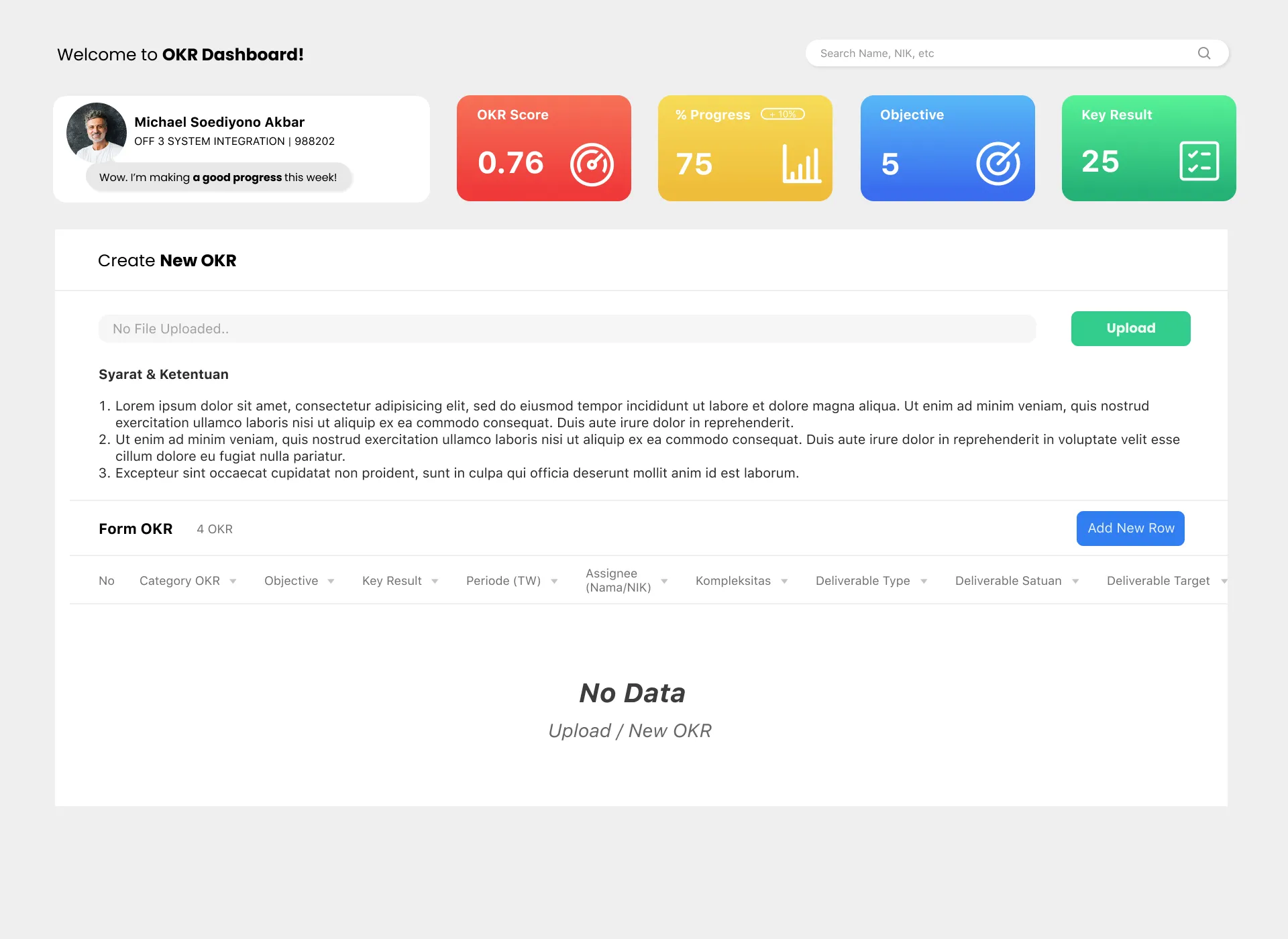
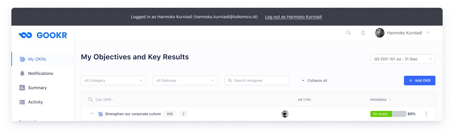
A personal dashboard where employees create, manage, and update their objectives and key results.
Employees need to see all their OKRs at a glance, drill into individual key results, and update progress without getting lost in a long flat list. I designed a dashboard page with a collapsible dropdown structure — each objective expands to reveal its key results. A “Collapse all” button lets users quickly reset their view when too many dropdowns are open. Filters help employees find specific OKRs by period or status.
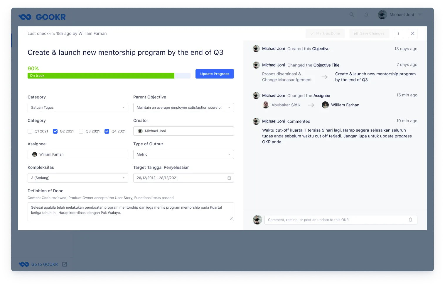
The OKR details popup lets employees update their progress, edit OKR data, and view a change log of all modifications and comments made on that key result.
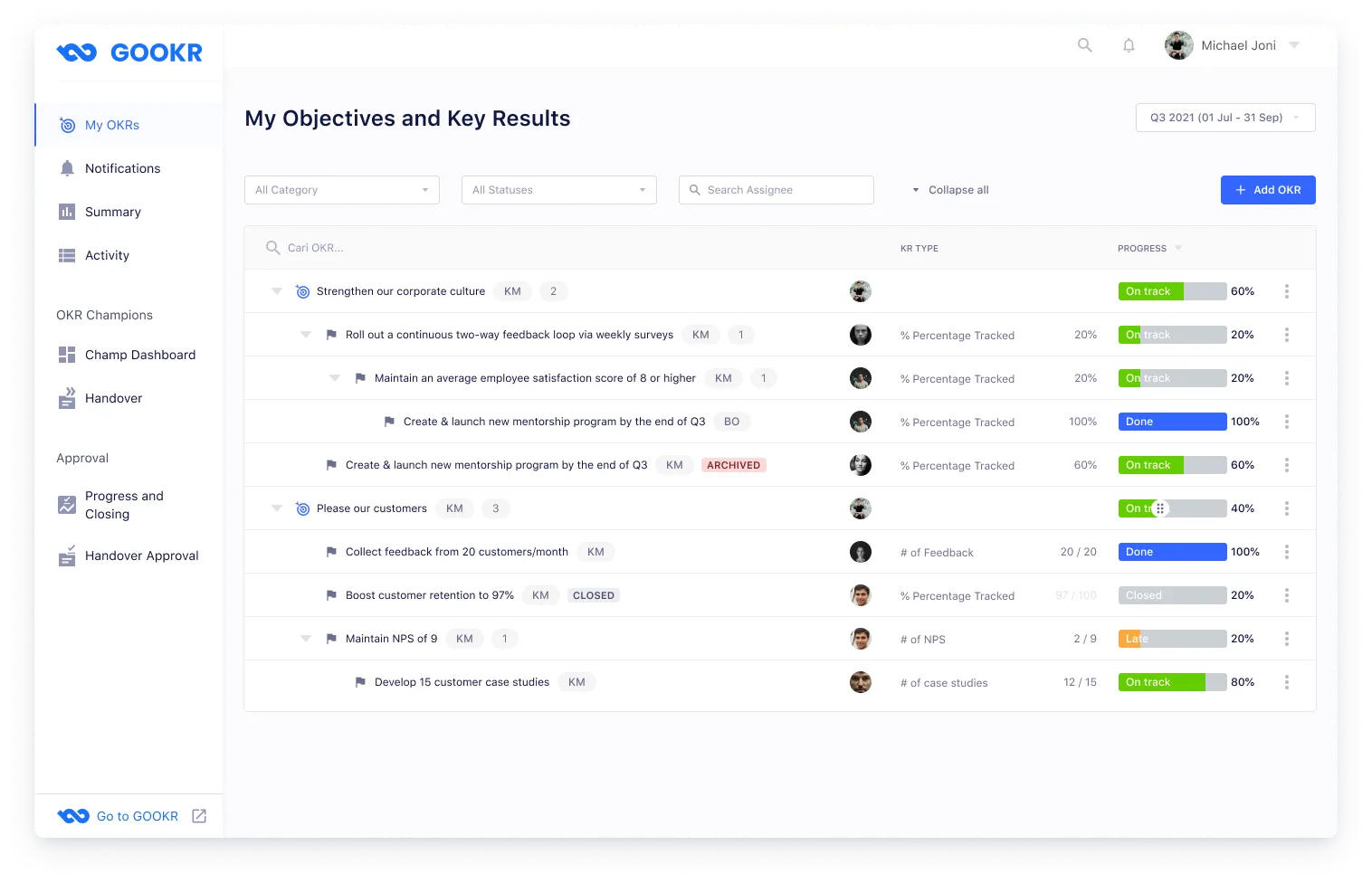
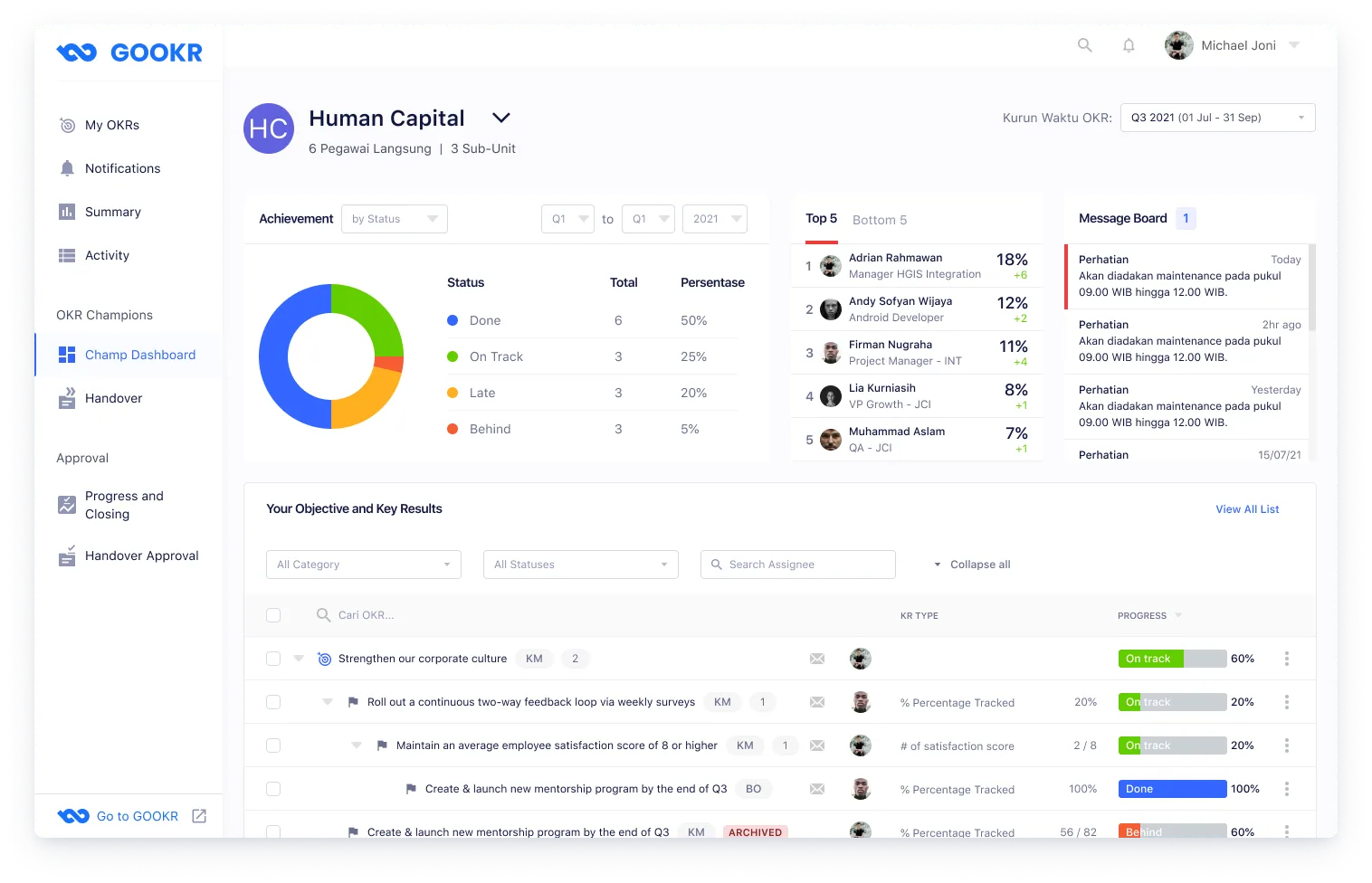
An admin dashboard for OKR Champions to monitor their unit's OKR performance.
Employees appointed as OKR Champions are responsible for the OKR health of their entire unit. One champion can be responsible for multiple units, so I designed the dashboard with a unit switcher dropdown to toggle between units. The page surfaces overall OKR status at a glance, making it easy to spot units or employees who are falling behind.
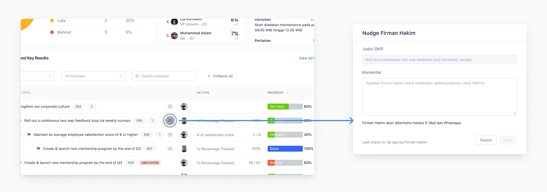
Many employees rarely updated their key results progress, creating stale data across units.
Problem
Progress updates are critical to track employee goal achievement each quarter, but many employees would go weeks without updating their key results. There was no mechanism to prompt employees to update — OKR Champions had no way to nudge their team other than sending manual messages.
Solution
I designed a nudge feature for OKR Champions. With a single action, champions can send reminders to employees to update their OKR progress. The reminder is delivered via email and WhatsApp, both of which are integrated with the platform, meeting employees where they already communicate.
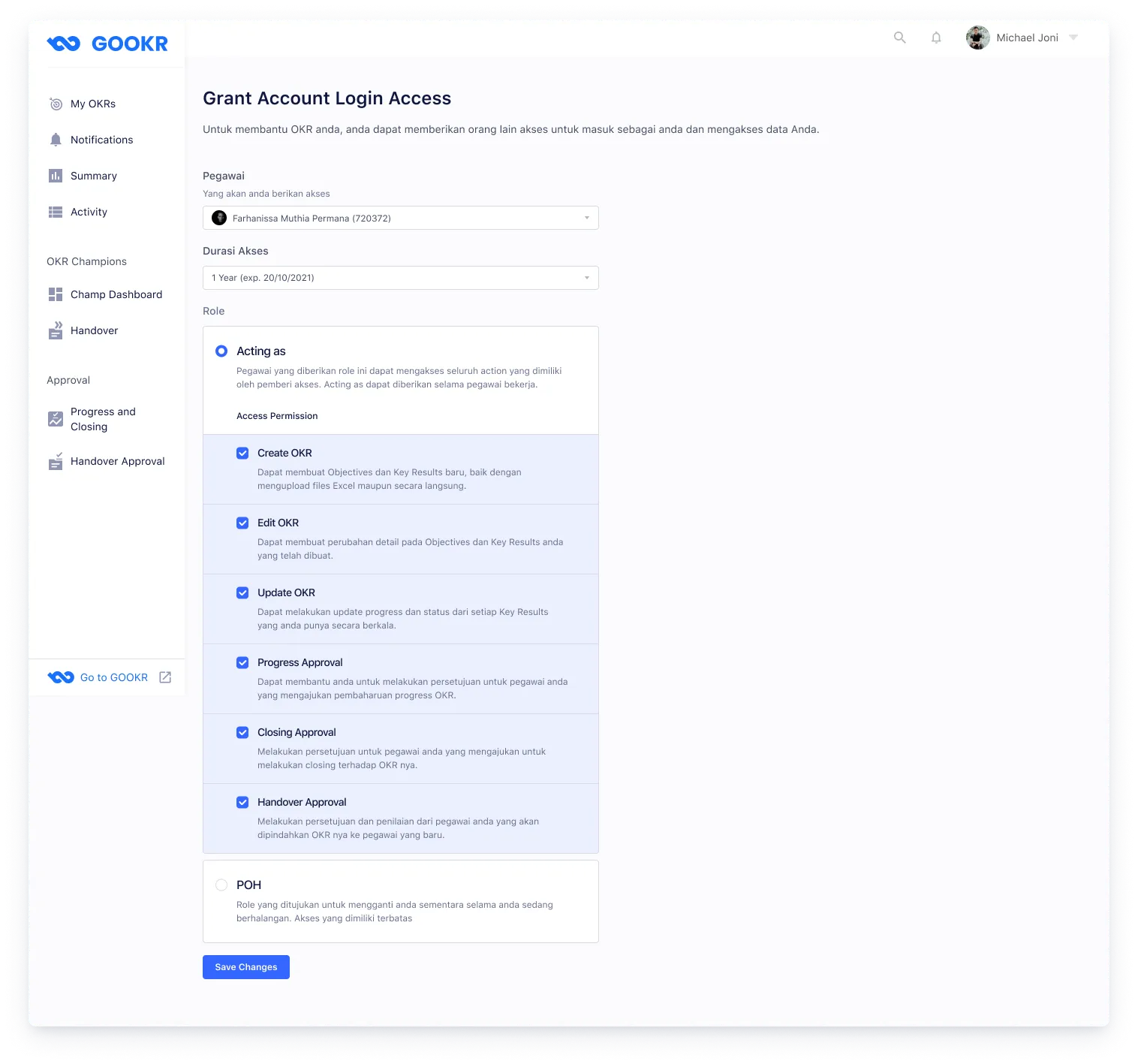
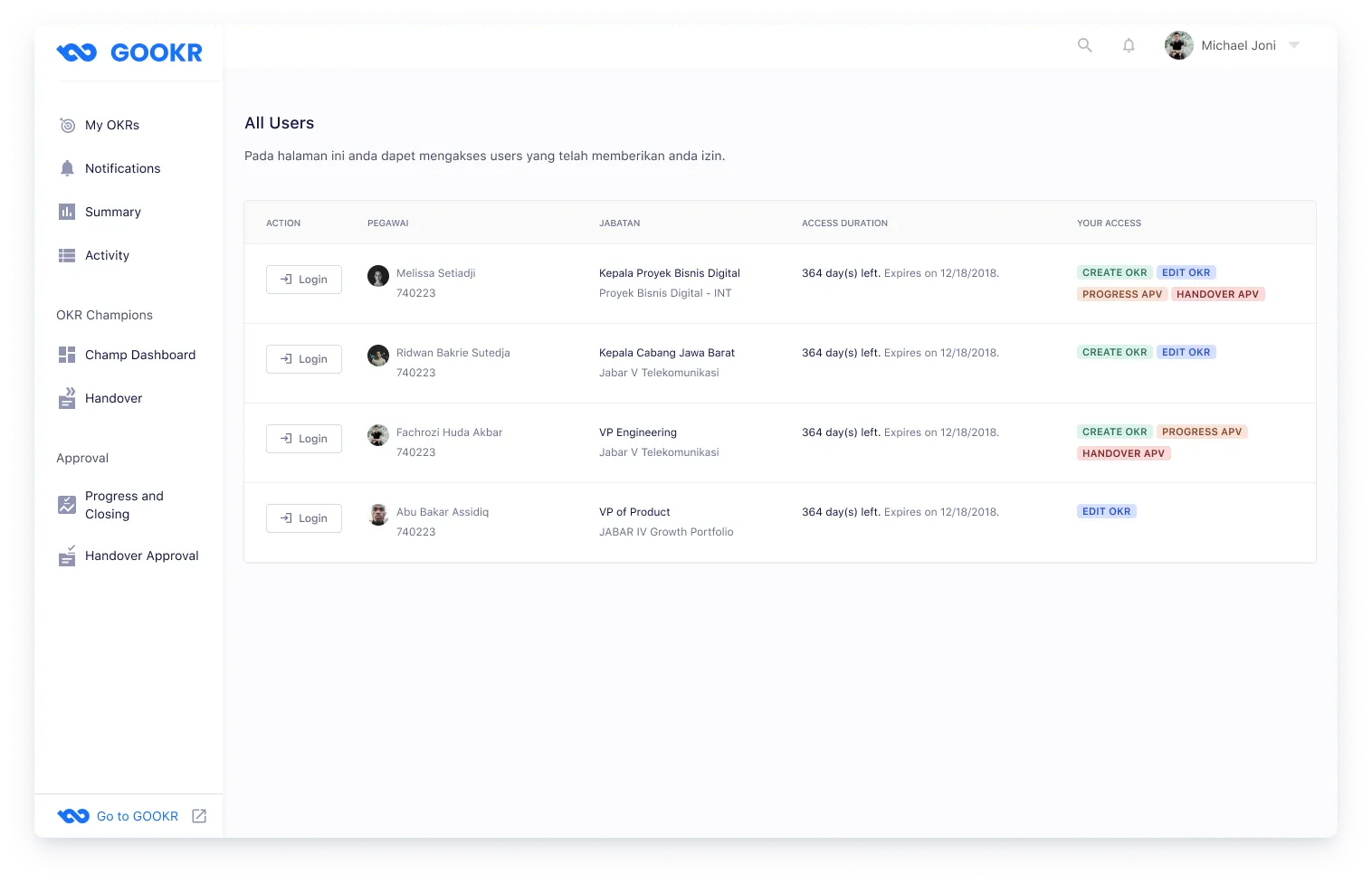
High-level managers were sharing their login credentials to delegate OKR management — a security risk.
Problem
Users in senior positions often didn't want to manage their OKRs themselves and delegated the task to an assistant. The only workaround was sharing their account username and password, which is a clear security violation. There was no official mechanism to grant temporary or scoped access to another person.
Solution
The delegate access feature lets users grant account access to another person without sharing credentials. Users can configure exactly what actions the delegate is allowed to take. When a delegate logs in as another person’s account, a persistent header banner appears at the top of the page — a clear visual reminder that they are acting as someone else, reducing the risk of accidental actions on the wrong account.
When employees change positions, their OKRs must be transferred to a successor.
During the work period, employees change positions — and the OKRs they own need to transfer to whoever takes over the role. In cases where no replacement has been assigned yet, the transfer still needs to be initiated so the OKR isn’t orphaned. I designed a handover management page for admins where they can initiate, track, and update OKR transfers. If the replacement field is left blank, admins can fill it in later once a successor is assigned.
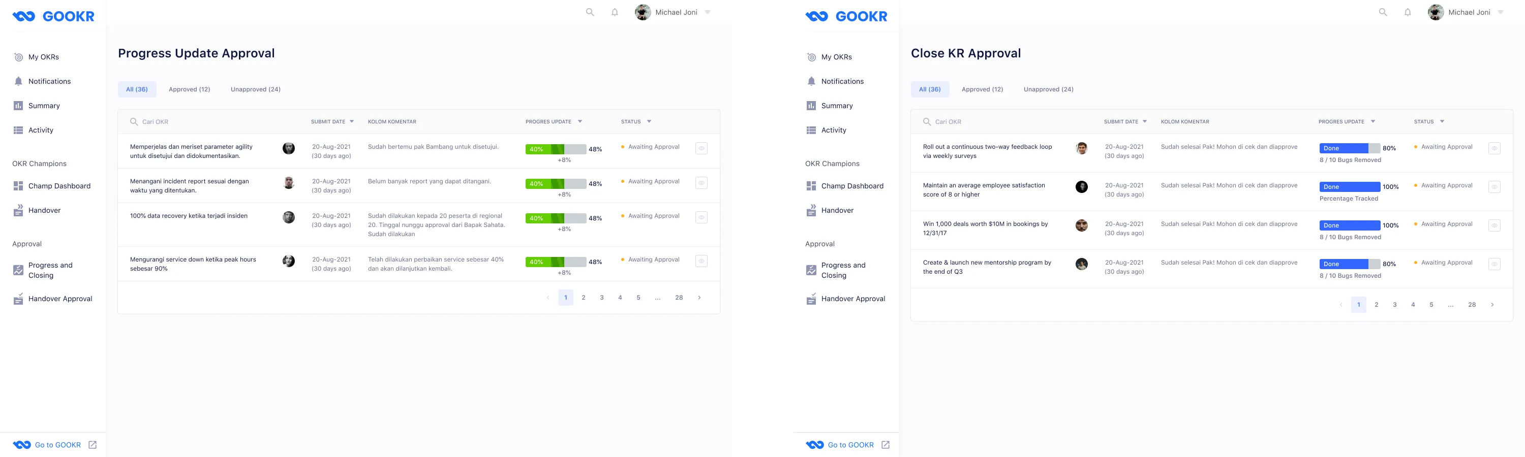
A structured approval workflow for unit heads to review progress updates, closures, and handovers.
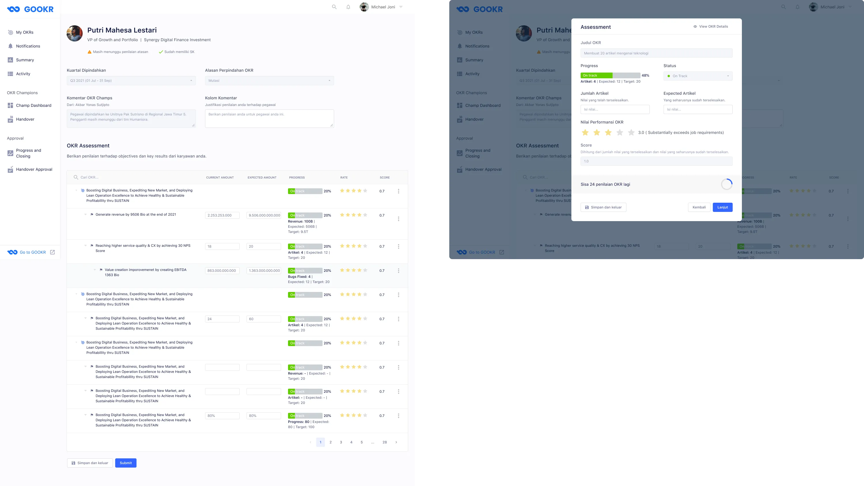
Unit heads need to approve three types of requests from their employees: progress updates, key result closures, and handover initiations. I designed a unified approval page with a table view, giving heads a clear list of pending items and their current status. From the table, heads can open an approval modal to approve or reject each request — and for key result closures, they also provide a star rating to assess the employee’s performance.
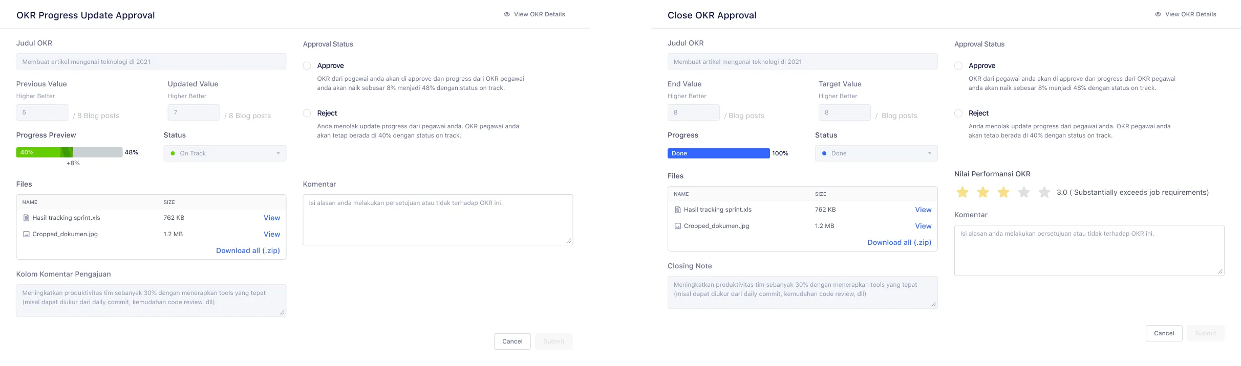
Supervisors assess each key result quantitatively and qualitatively before approving a transfer.
For handover approvals, a unit head must evaluate the employee’s OKRs before the transfer is finalized. This is more involved than a standard approval — each key result requires both a quantitative score and a qualitative star rating. Because an employee’s OKR list can be long, I designed the form so supervisors can save their progress mid-assessment and return to finish it later.
What I learned from designing for 24,000+ enterprise users over four months.
-
Direct designer–engineer communication matters. Even with a project manager facilitating, gaps emerged when design changes weren’t communicated directly to engineers. An engineer built from an outdated design file because I hadn’t flagged the update clearly. After that, I added comments in Figma to flag every revision — and in future projects I’d maintain a proper version history to eliminate that class of error entirely.
-
UX copy is product-specific, not generic. I assumed standard OKR terminology would translate cleanly to this company. It didn’t. Several labels that are common in OKR software had different meanings internally. Good copy requires learning the vocabulary users already have — not importing vocabulary from the category.
-
Balancing user and organizational needs is real work. Users wanted frictionless flows — fast submissions, no required comment boxes. The organization wanted a paper trail. The comment box requirement wasn’t just friction — it was a governance control. Understanding that framing changed how I designed the copy and placement of those inputs.
-
Being excluded from testing limits iteration quality. The client ran internal usability testing without me present. I received summarized feedback but missed the nuance of watching users in context. Partial feedback still shaped the design, but I’d push harder in future projects to be part of the testing process — or at minimum, to review session recordings.
-
Document every design decision. This project had no formal design changelog. Miscommunications with engineers were a recurring cost. A lightweight decision log — even just a dated comment thread in Figma — would have saved revision cycles and kept the whole team aligned on which version was current.