Redesigning KoinNEO's Payment Experience
KoinNEO is KoinWorks' core product for Indonesian SME sellers, helping them manage daily operations and receive payments via QRIS and payment links. The problem: Users repeatedly reported to CS that they couldn't locate QRIS quickly, the Quick vs. Advanced Request split forced confusing upfront choices, 70%+ of payment links created each month never settled, and overloaded forms didn't match the speed of real-world selling. The solution was to surface QRIS as a standalone entry point, unify the two request types into a single progressive-disclosure form, and cut fields down to what sellers actually needed in the moment. The redesign shipped with a 32% lift in transaction volume, +Rp 18 billion in transaction value, and an 11% drop in cancelled/expired links in the first month.
We wanted to grow our transaction volume and GMV from our payment features.
So we looked at the data first.
70%+ of all payment links were abandoned every month. Only ~20% actually settled. For every 10 links a seller sent, only 3 resulted in money received. We also noticed CS tickets from sellers who couldn't find QRIS in the app.
Our assumptions:
- QRIS was buried inside the Payment Link menu
- Sellers didn't understand Quick Request vs. Advanced Request
- The forms were too heavy, too many fields for sellers in a rush
To validate, we ran an online survey to recruit participants, then conducted in-depth interviews and usability testing with our sellers.
Research findings - user pain points
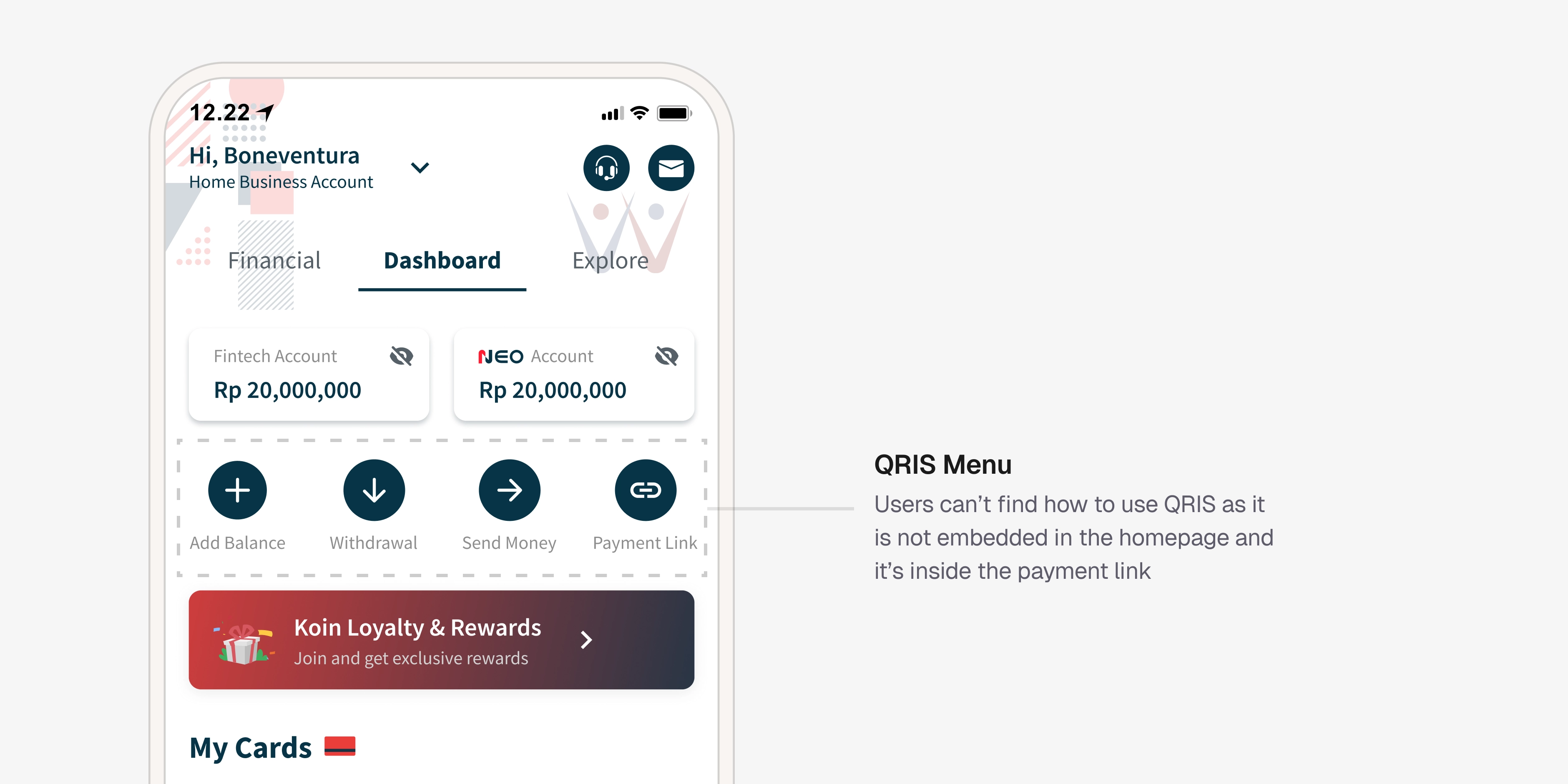
QRIS was buried
Sellers couldn't find QRIS quickly because it lived inside the Payment Link menu, with no direct path from the homepage.
Downloading/printing QRIS was a chore
Sellers wanted to quickly grab a printable QR for in-store display, but had to navigate through multiple steps to reach it.
The Quick vs Advanced
Most users don't categorize their needs as "quick" or "advanced", they think "I need to get paid for X." Forcing a choice upfront created hesitation, wrong selections, and rework.
Forms felt too long
The default form exposed too many fields when all the seller had was an amount and a person to send it to. Users either abandoned or filled fields with junk data just to get past them.
Rushed sellers made errors.
Sellers creating links on the fly frequently entered wrong amounts or missed required fields.
Buyers paid late or not at all
Buyers sometimes didn't pay within the specified window because they didn't have funds yet, causing links to expire.
Orders changed after the link was sent
Buyers added or swapped items after receiving a link, creating amount mismatches between the link and the actual order.
Increase transaction and error-free payment.
Business Goals
Increase transaction volume and GMV. Reduce CS tickets related to payment navigation. Reduce the cancelled/expired rate by cutting rework.
User Goals
Show QRIS instantly. Create payment links fast and error-free. Download or print QRIS for in-store display.
Optimizing Payment Flows: Progressive Disclosure and Streamlined QRIS Access to Reduce Cognitive Load
Competitive insights for ideation
Before designing, I studied payment link features from Doku and Xendit, both payment vendors KoinWorks integrates with. Patterns that worked on their platforms were likely feasible for us technically. This gave me a practical foundation for ideation.
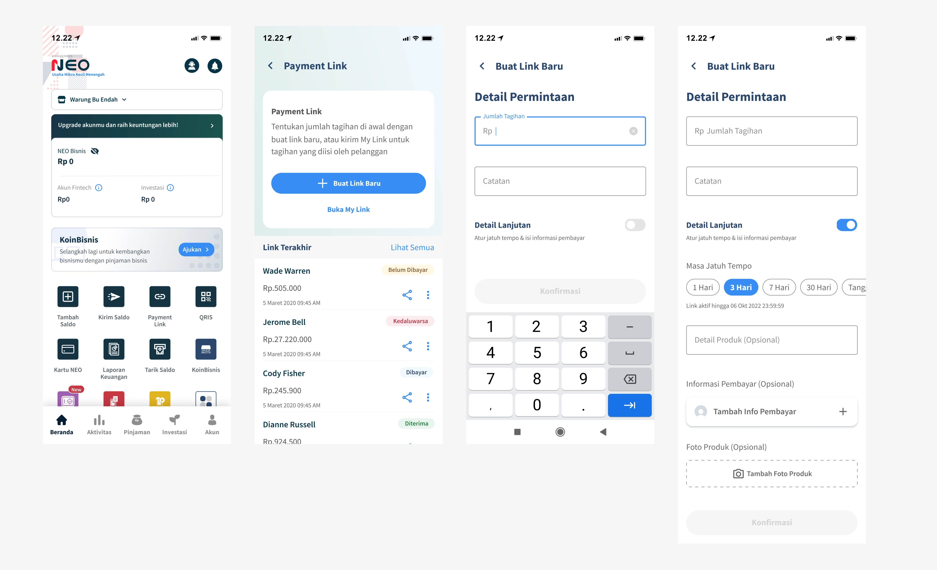
Separating QRIS from Payment Link
Before: QRIS lived inside the Payment Link menu. Too many taps for a seller with a buyer at the counter.
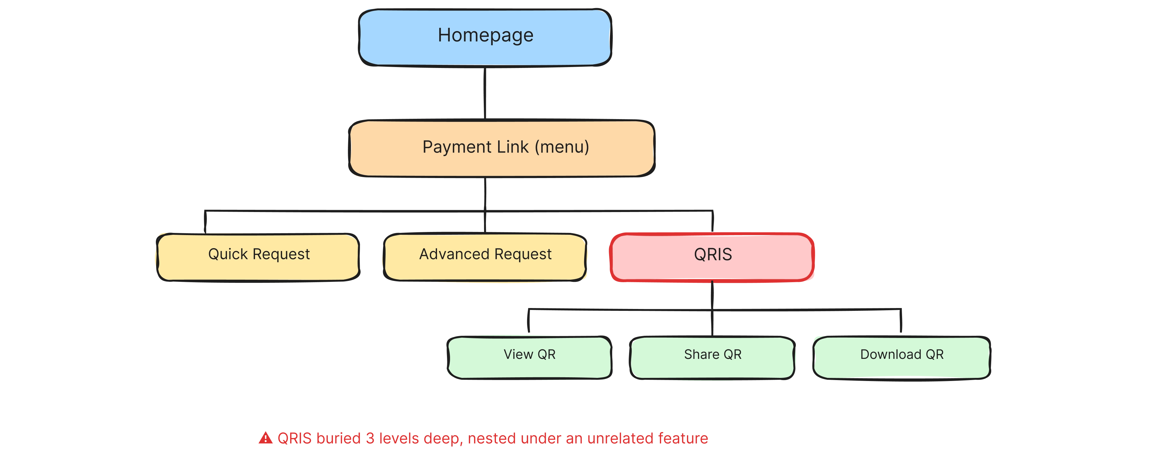
Current design of our QRIS payment page
QRIS sat three levels deep inside a payment link menu. A seller trying to flash a QR to a buyer at the counter had to: tap homepage → find Payment Link → tap into QRIS → then act. Mentally, "Payment Link" and "QRIS" are two different payment methods, so nesting one inside the other was a naming and hierarchy mismatch.
After: QRIS is its own entry point on the homepage. Sellers tap directly into their Business QR Code screen, NEO QR and QRIS side by side, swipeable. Share, save, or "Download for Print", all one tap away.
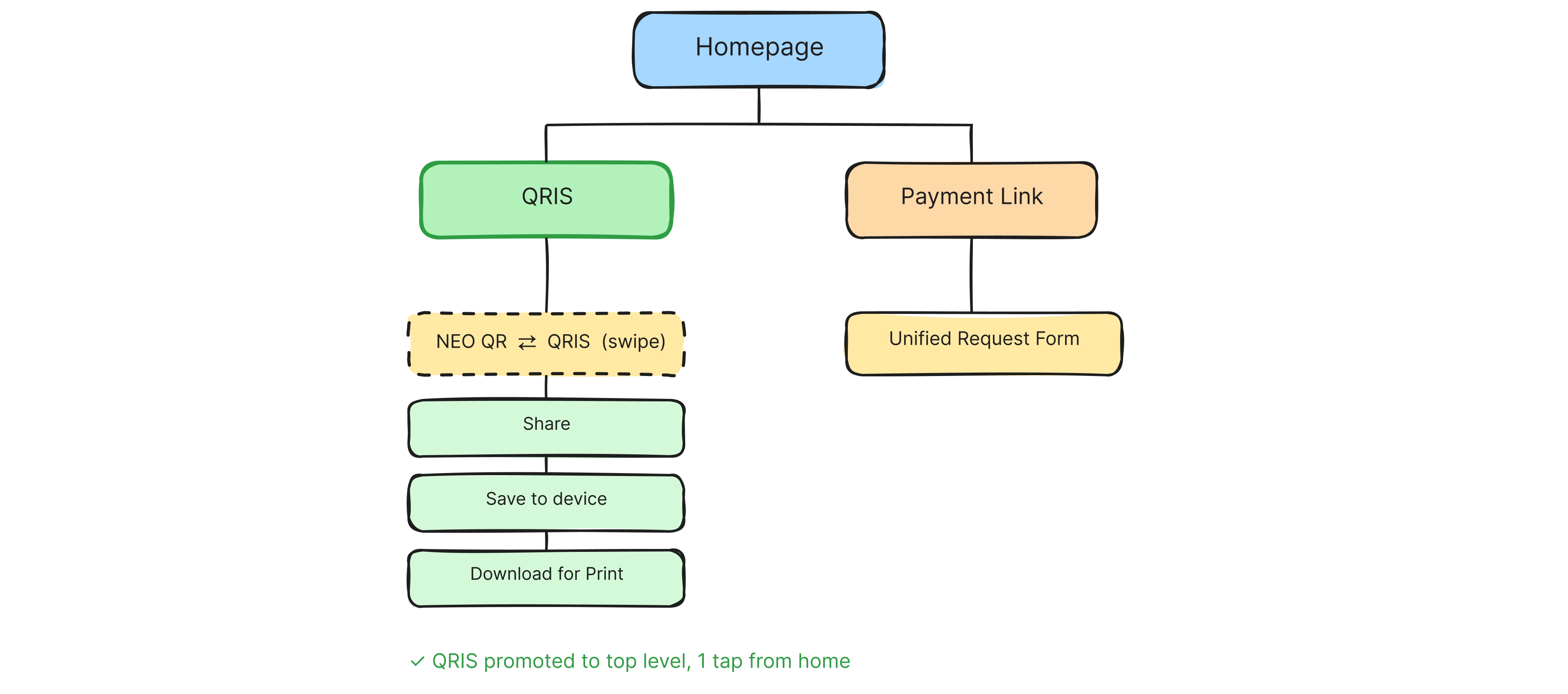
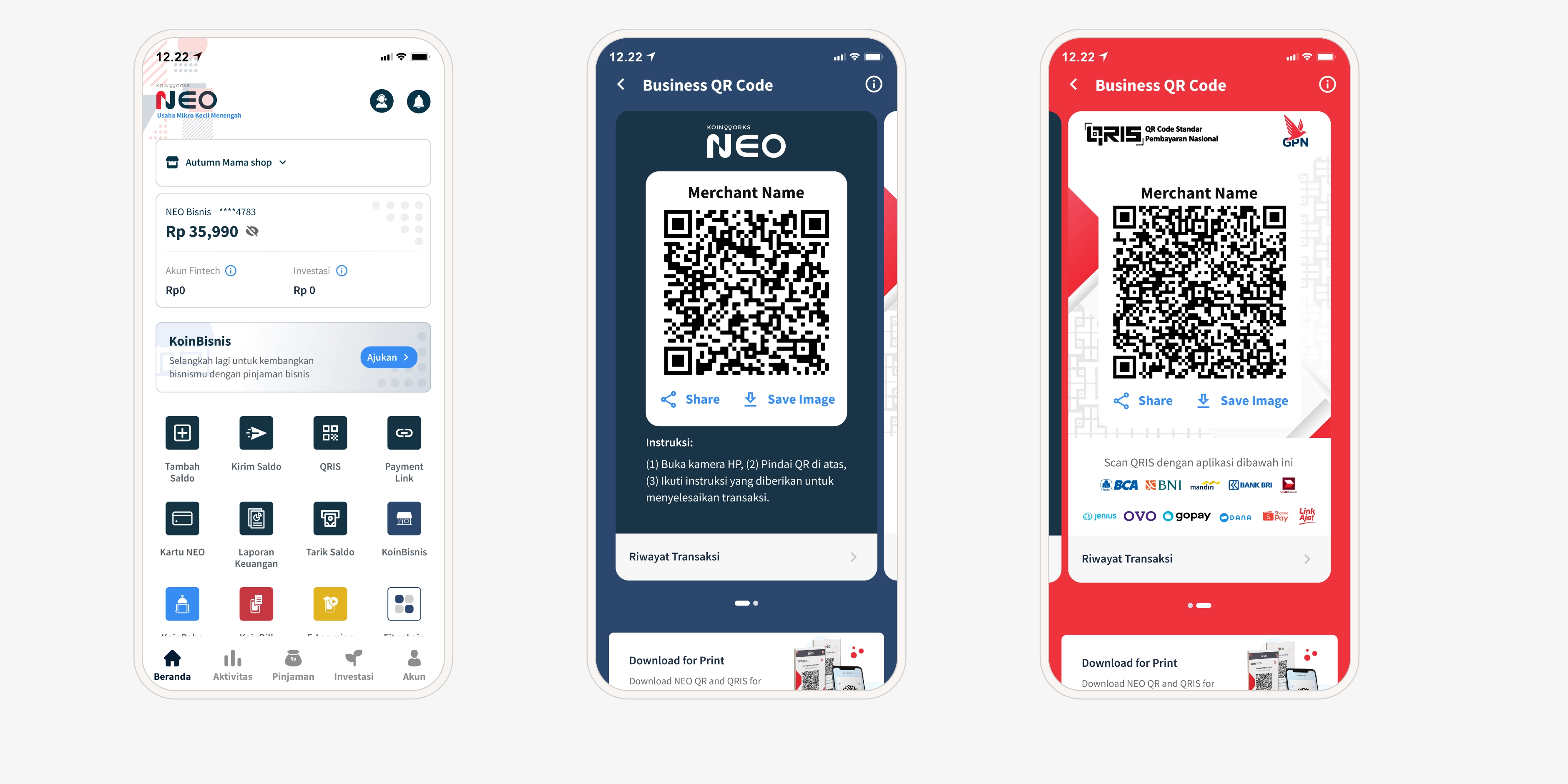
Redesigned QRIS entry point
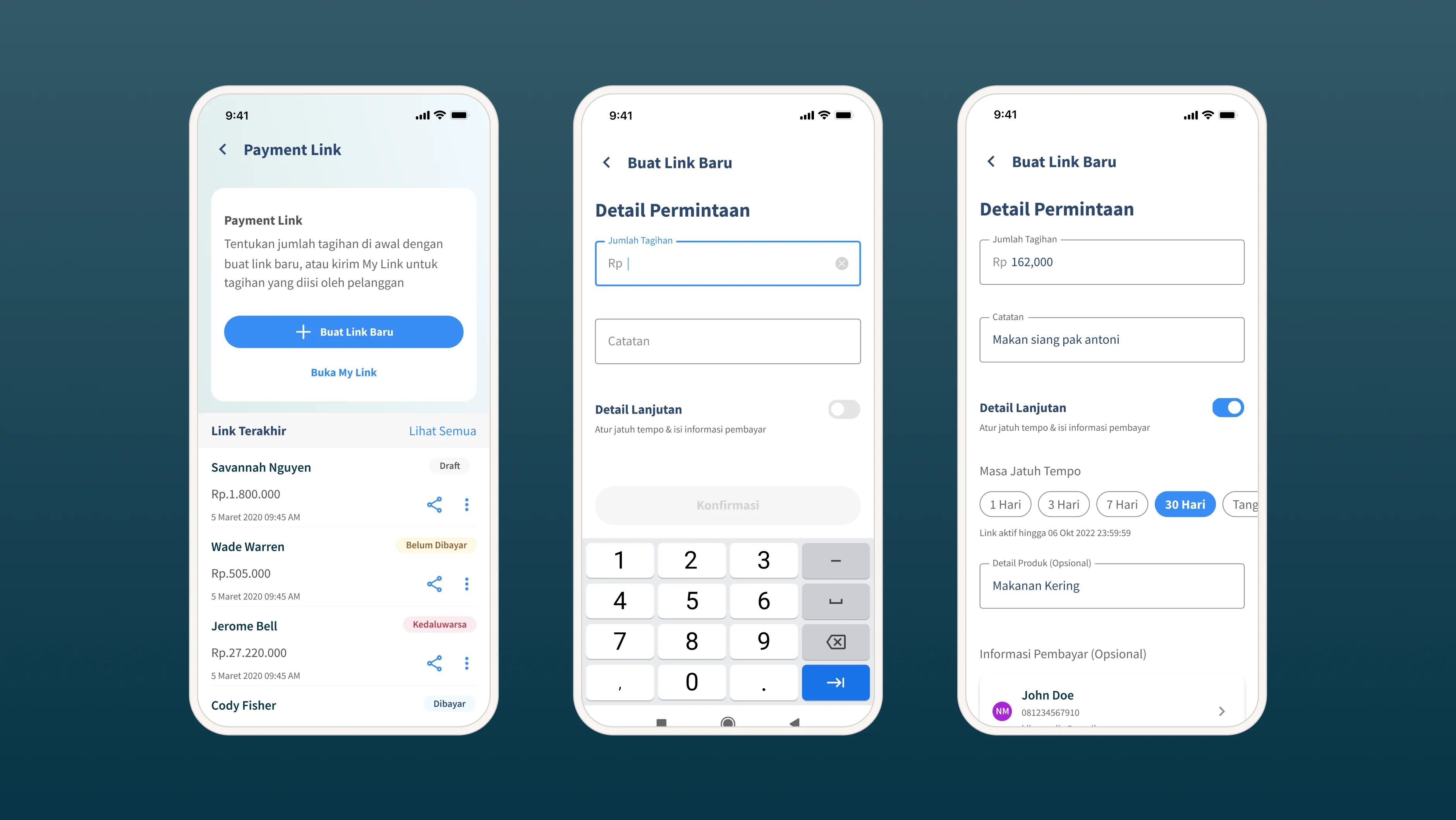
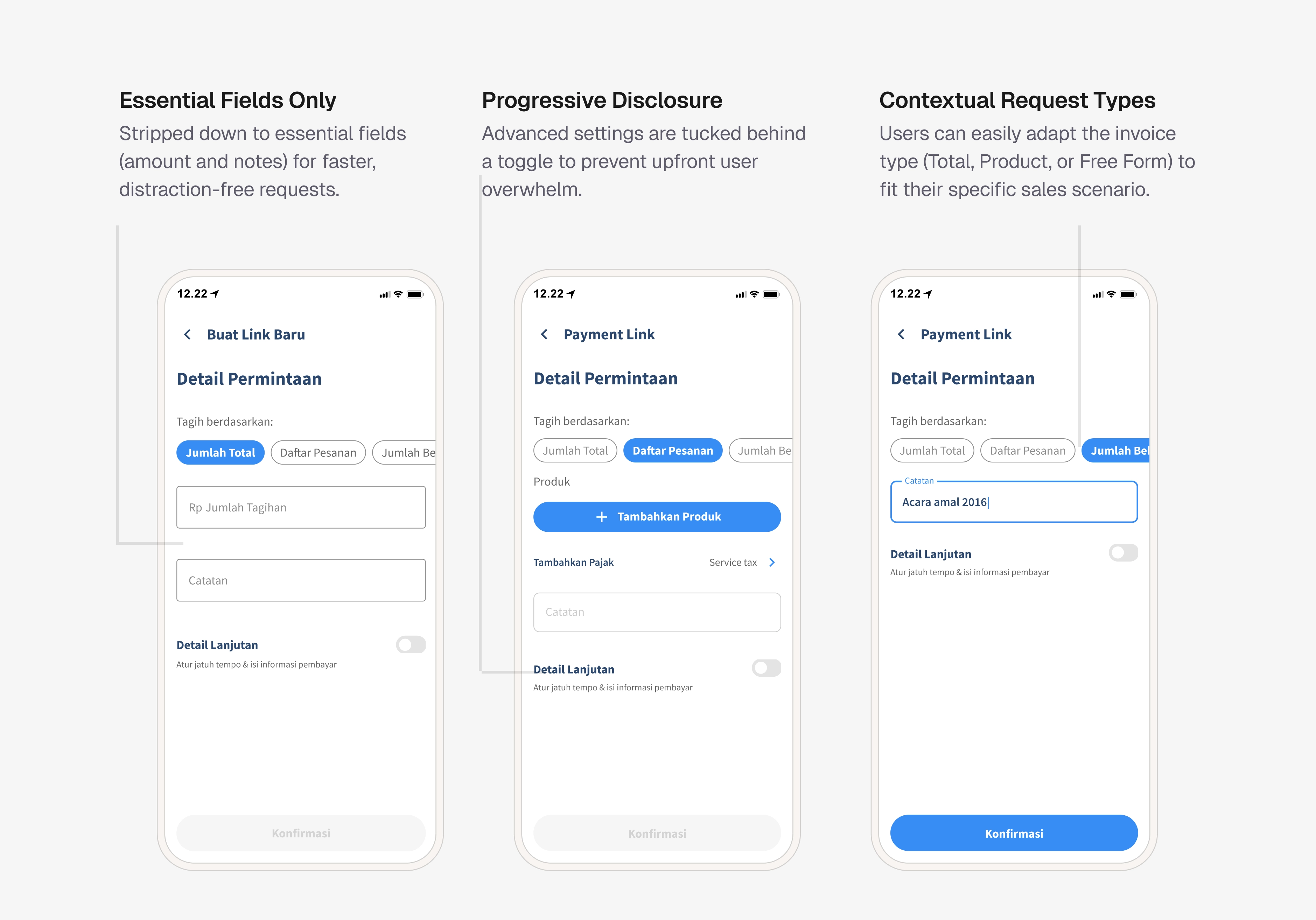
Unifying Quick Request and Advanced Request
Before: Two separate paths. Quick Request (fewer fields) and Advanced Request (contact-first, more fields). Sellers didn't understand the difference and the Advanced path blocked them at the first step by forcing a buyer contact selection before they could even enter an amount.
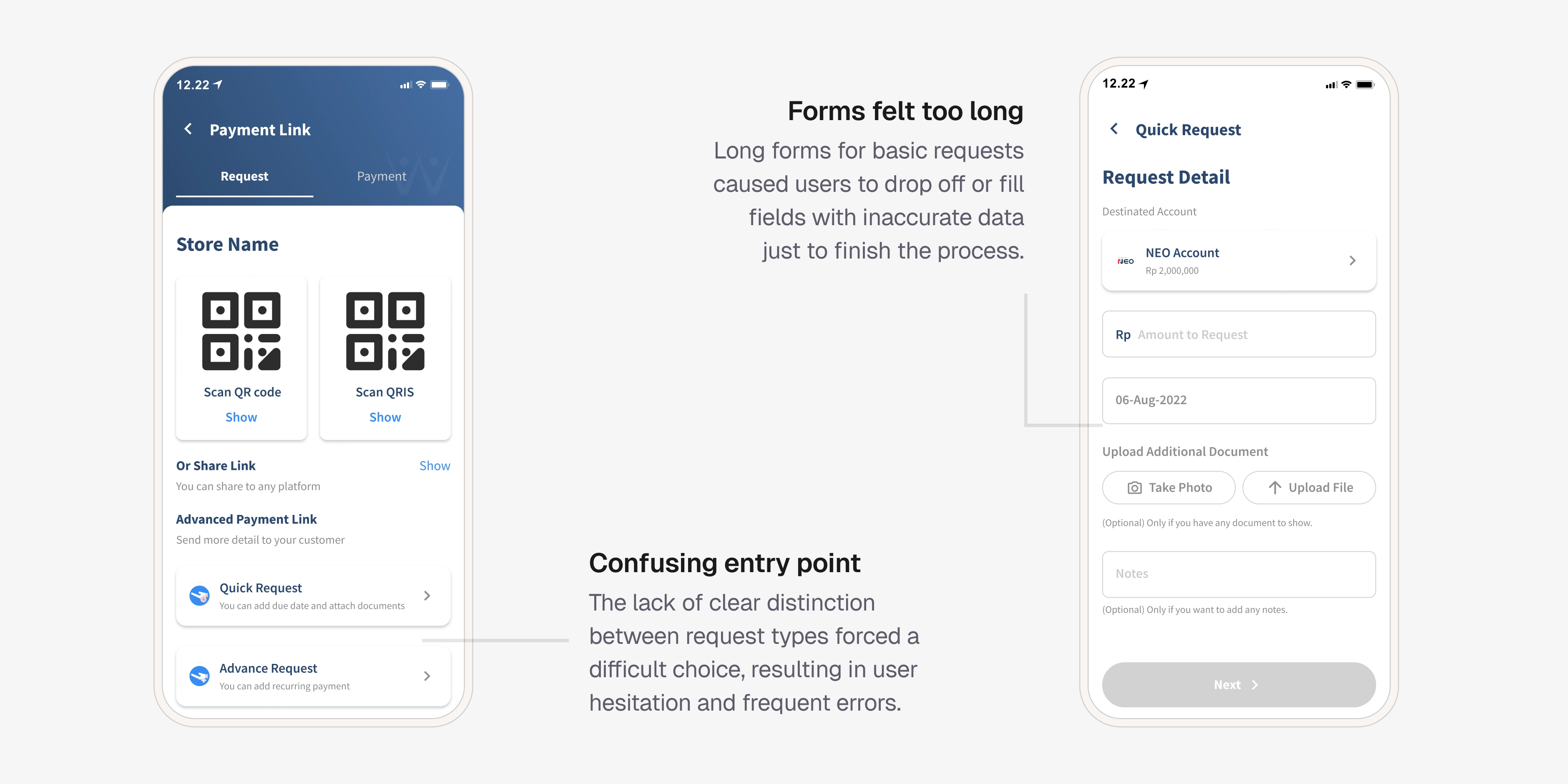
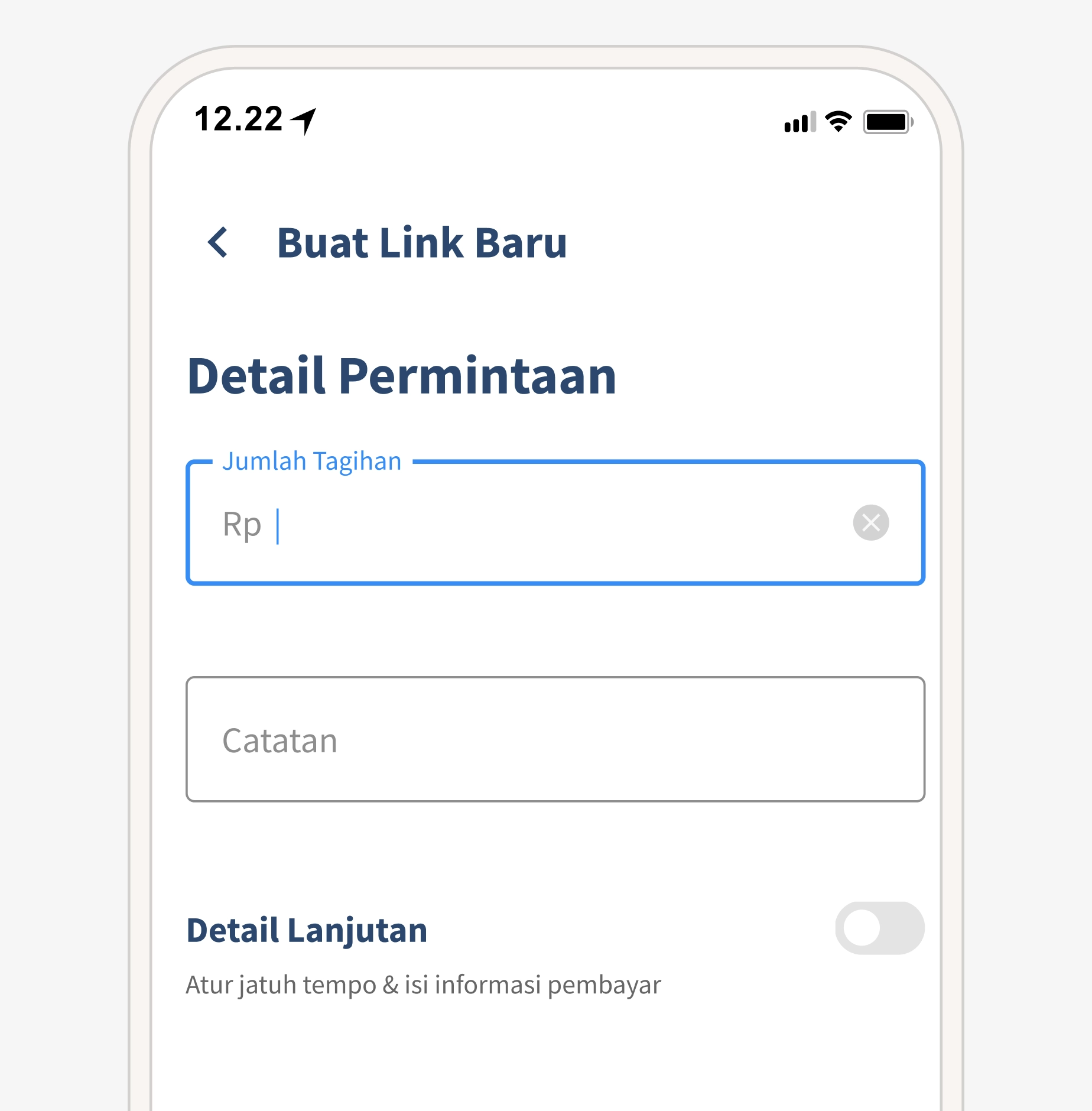
Current quick request link design
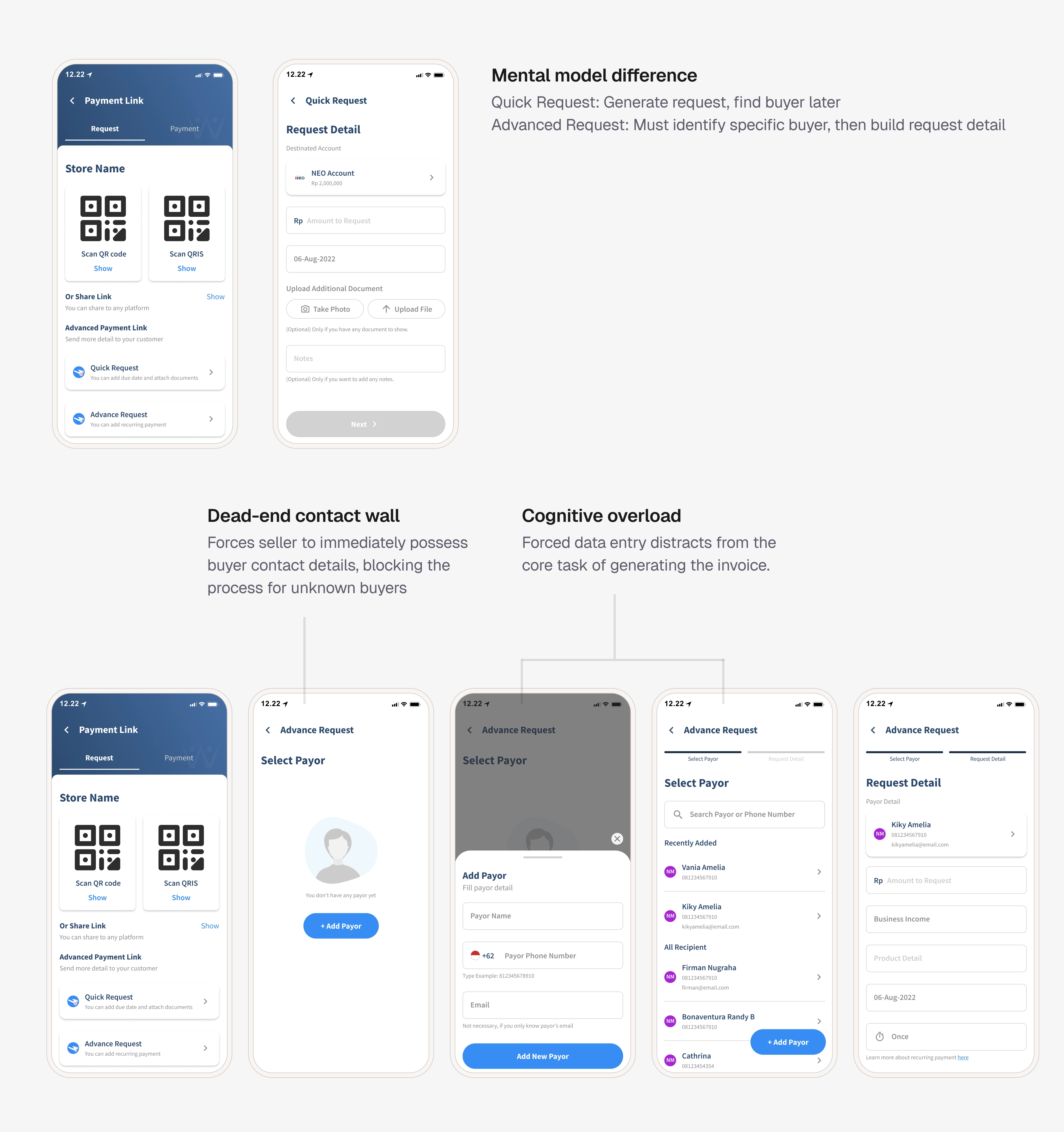
Quick Request vs Advanced Request
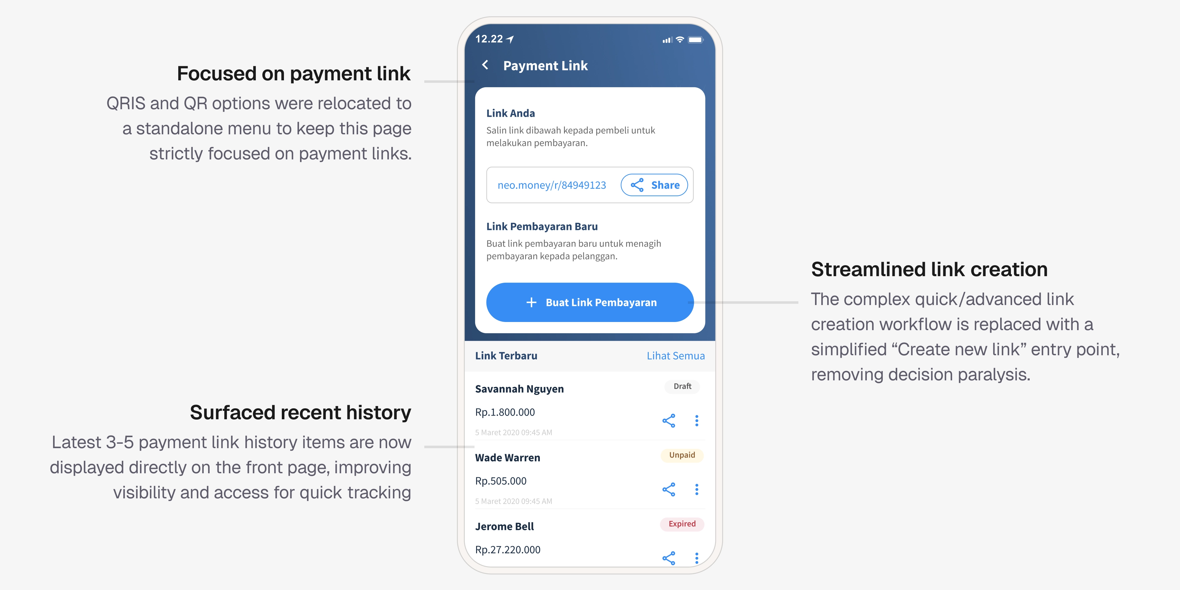
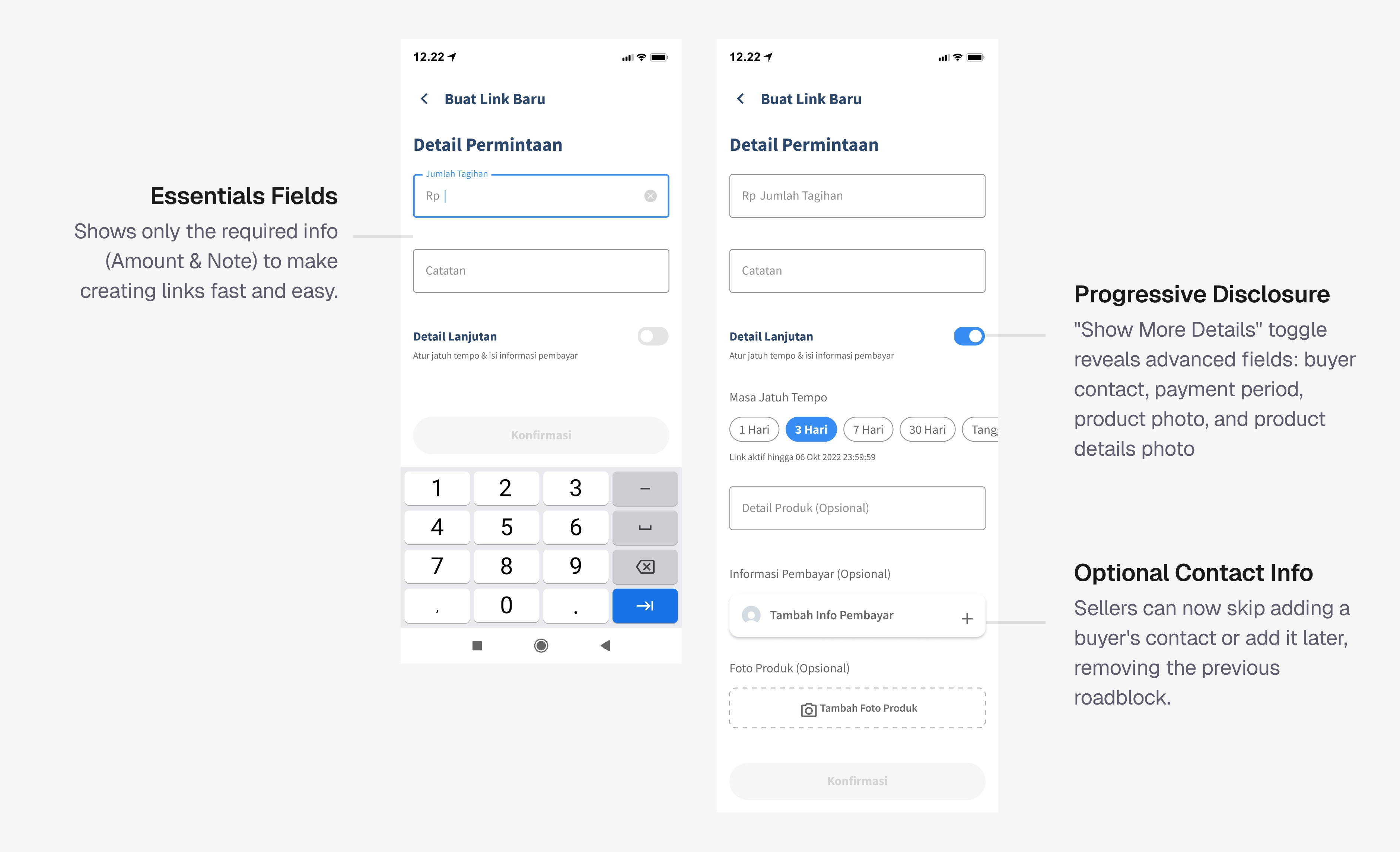
After: One single form. Essential fields first, amount and notes. Optional details behind a "Detail Lanjutan" toggle (due date, product details, buyer info, attachments).
First iteration of the unified form - key decisions
The first version of the unified form carried a few ideas that looked clean on paper but cracked in testing. Worth documenting because the "why they failed" is where the real learning sits.
First iteration of the unified form
Feedback from user interviews:
Confusing Link
Users are confused by the 'Link Anda' label, mistakenly believing it refers to the most recently generated buyer link.
Payment status unclear
Users are unclear on the meaning of the 'Settled' status.
Request types on first redesign iteration
Chips were read as steps, not options.
Sellers assumed they had to go through Jumlah Total → Daftar Pesanan → Jumlah Bebas in sequence.
The static link was mistaken for the latest transaction link.
Two of three sellers thought the general link at the top was the most recent link they'd just sent to a specific buyer, and tried to share it as such.
Requesting by total amount is enough
They said total amount was all they ever needed, they'd already shared the itemized invoice over WhatsApp before reaching for KoinNEO.
Fixes going into the final version:
- Removed the billing type chips entirely. Defaulted the form to total amount, the one mode sellers actually used.
- Moved the general/static payment link into a popup accessed from a clearly labeled secondary action, separating it from transaction-specific links in the list.
- Kept the progressive disclosure and the amount validation as-is.
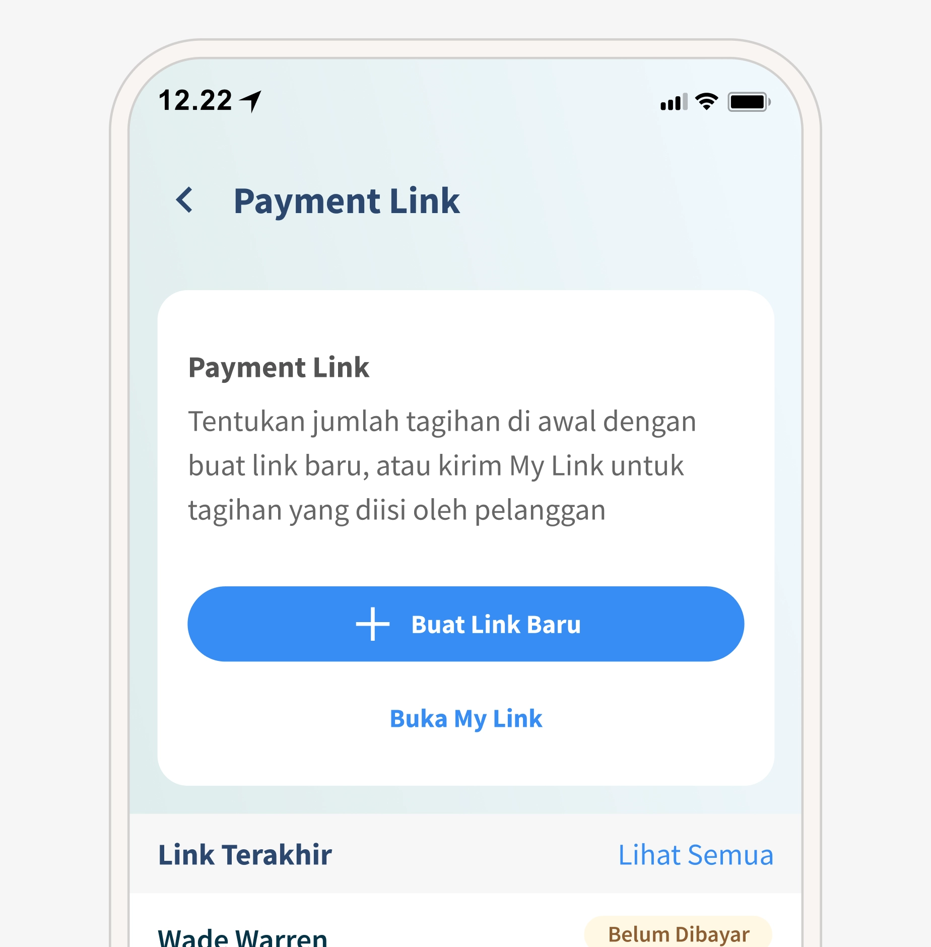
Static payment links now open in a popup to prevent confusion with recently created links.
Removed request types. A default "total amount" is enough since users already share itemized invoices via messaging apps.
Achieving in our first month
Transaction Volume
+32%
Transaction Value
+Rp 18 B
Payment Link Expired Rate
-11%
CS complaints on QRIS navigation
↓ Drop
These numbers confirmed that the friction points we found in research, buried QRIS, confusing request split, overloaded forms were real blockers. Removing them had a direct impact on business metrics.
UX improvements drive metrics, but business decisions can override them.
Usability testing after redesign is non-negotiable. My first iteration introduced chips I thought were helpful. Testing showed sellers read them as steps, not options, and didn't need the extra modes. Without that UT round, we'd have shipped new confusion while fixing old confusion.
UX improvements drive metrics, but business decisions can override them. The 32% increase was real. A month later, the business introduced fees on payment links. Over six months, transaction volume dropped from ~17,000 to just 40. The feature worked; the pricing didn't. Next time, I'd push to be involved in pricing discussions before launch, so design and business strategy are aligned.
Not every problem fits in one project, and that's okay. Two issues from research couldn't be addressed: buyers changing orders after receiving a link (vendor couldn't support editable links), and buyers forgetting to pay before expiry (notifications existed but needed deeper work). Both remain future opportunities. Scoping honestly made it easier for the team to prioritize what comes next.
Beyond this case study, I also redesigned the printed QR/QRIS design for in-store display, the buyer-facing payment link page, and the payment link onboarding page. These were part of the same project but not covered here.
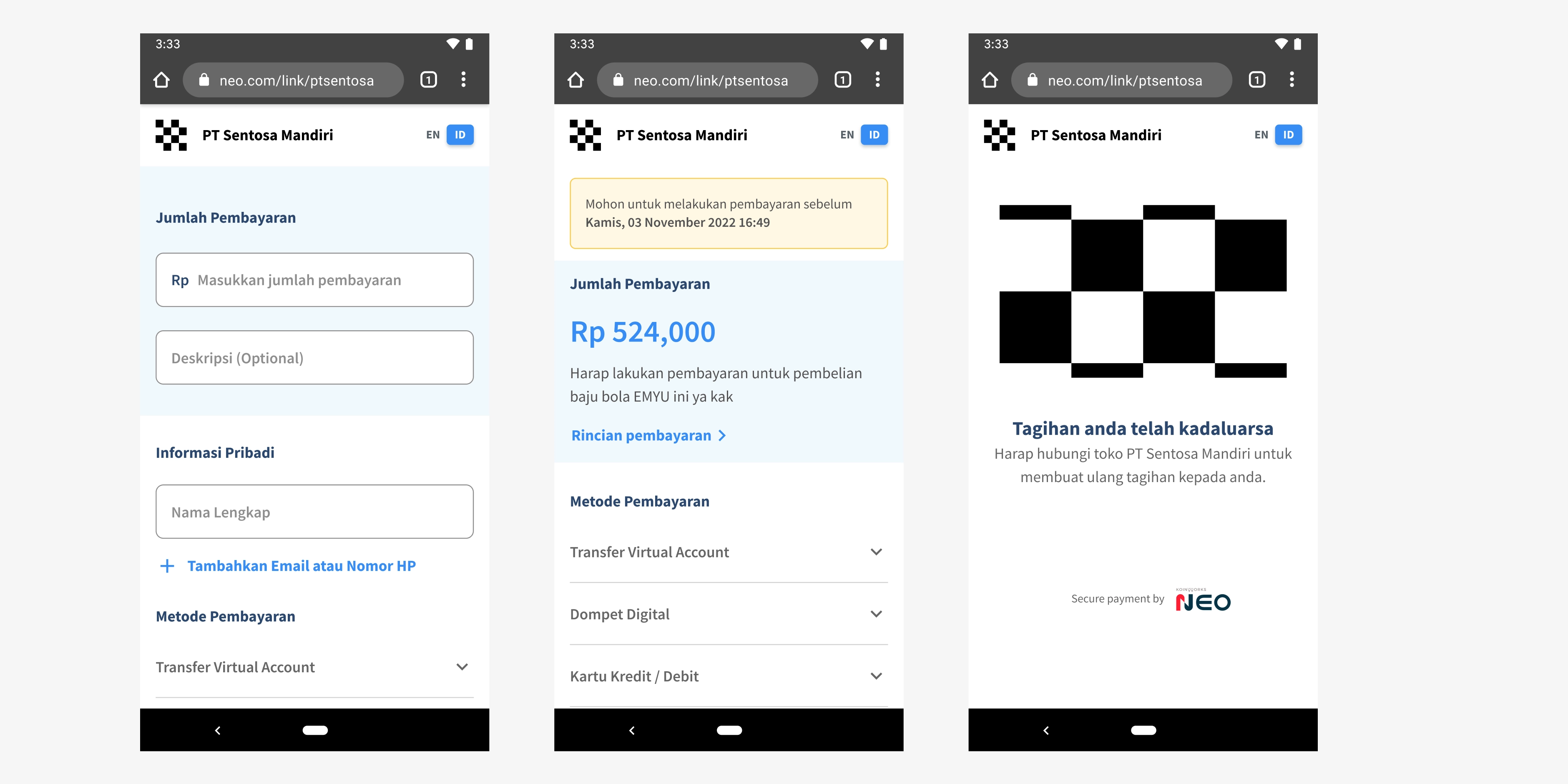
Redesigned Buyer-Facing Payment Link Page
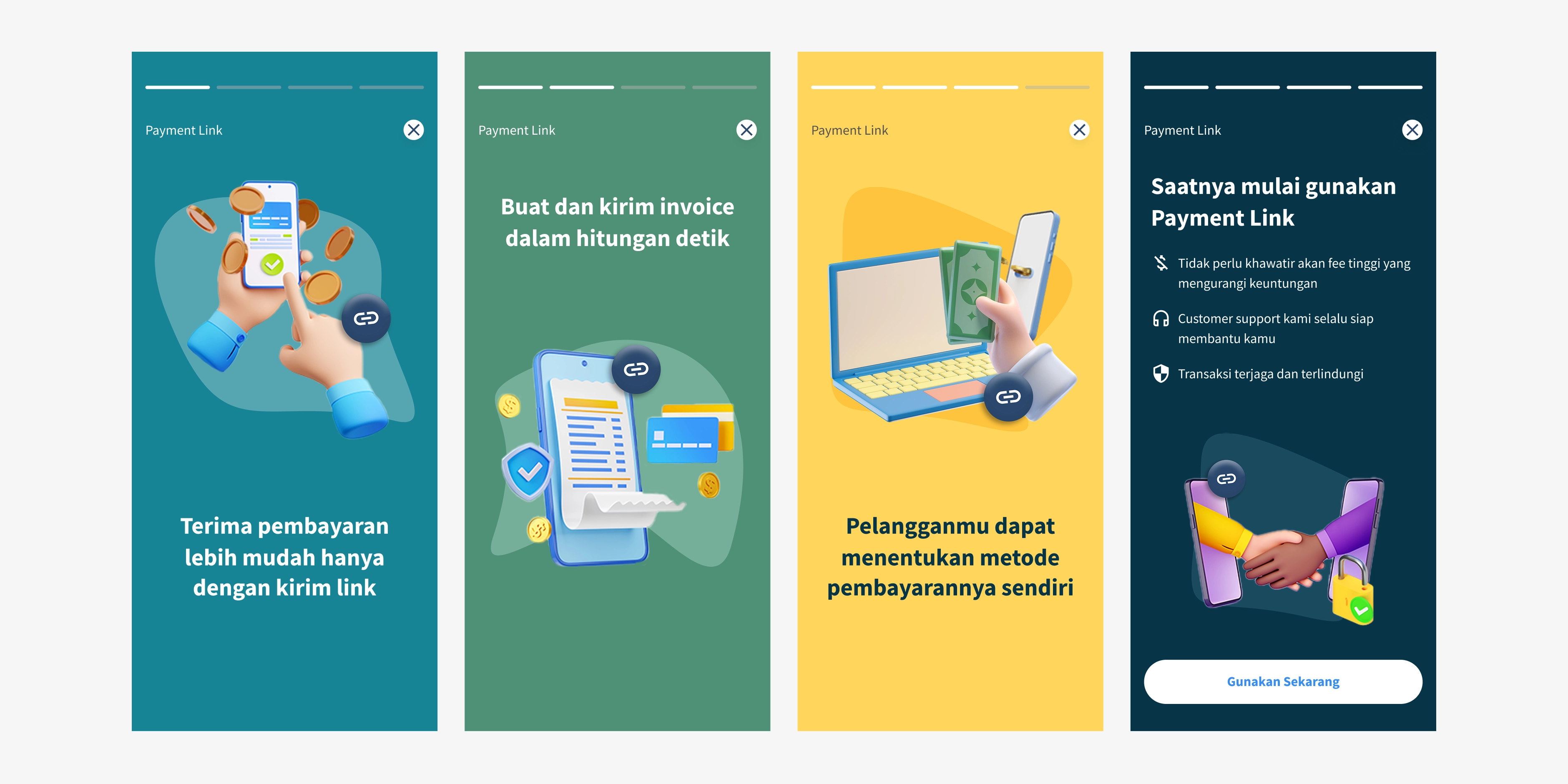
New onboarding pages for payment link
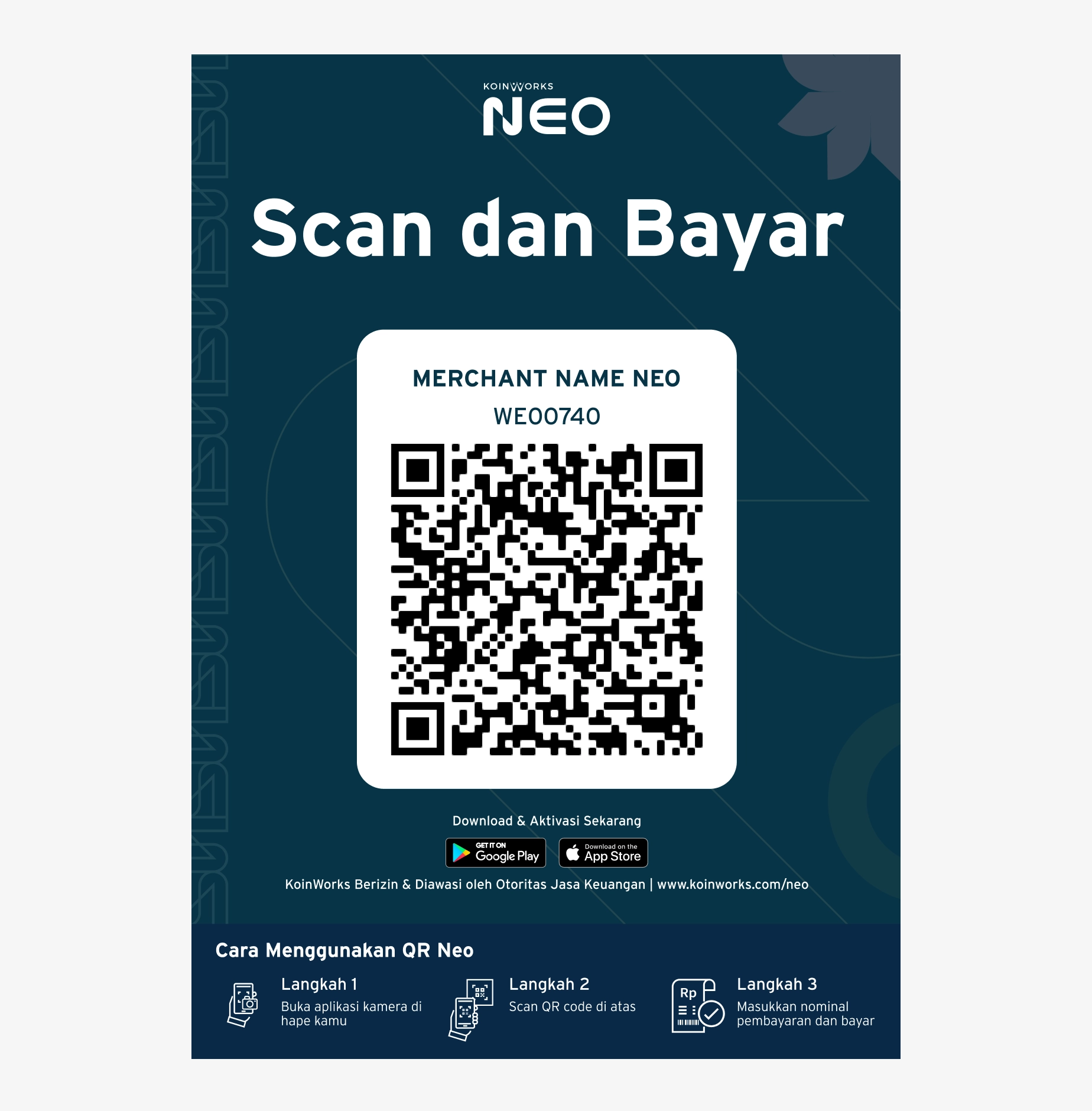
New QR NEO print design. This design aligned with our brand style and includes clear instructions on how to use QR NEO.
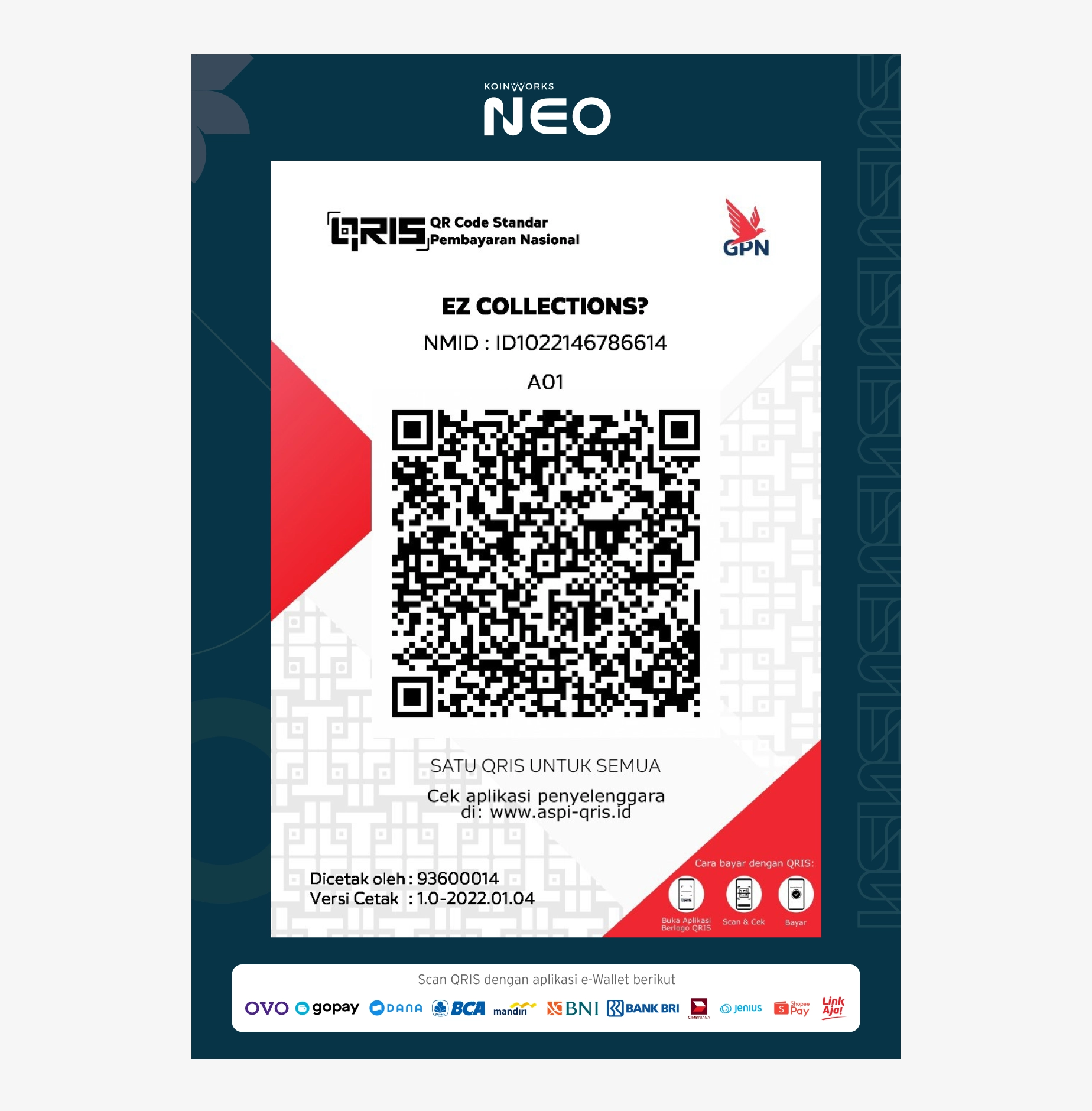
We are updating our QRIS to comply with the official standard QRIS design guidelines.