Improving KoinRobo's Products Page
KoinRobo is an investment product from KoinWorks that provides an automatic funding mechanism for P2P lending. It offers lenders predictable returns while channeling funds toward various community social causes. While evaluating the product's investment journey, I identified a potential point of friction: the cognitive load placed on users when selecting between multiple social causes. I hypothesized that this complexity might lead to user hesitation and delayed investments. From initial data revealed that users were largely bypassing the social cause selection and defaulting to products with the highest return.
I collaborated with a design researcher and product manager to study the KoinRobo product purchase experience.
Usability Testing — Conducted with 6 KoinRobo users to gather insights, task success rate and time-on-task data.
User Interviews — Follow-up questions after usability testing to deep dive into users’ concerns and inputs about completing the purchase task.
"Saya bingung, dimana ada ketidaksamaan antara tenor dan retur dengan dampak sosial yang kita pilih. Misalnya, tenor 1 bulan hanya tersedia untuk produk jenis 'Lokal Support Lokal'. Lalu return untuk tenor 6 bulan di produk 'Female-led' ditawarkan sebesar 8%, namun untuk tenor sama di produk 'Best Performing' malah retur nya hanya 7%."
- User Quote
Key Insights
- Lenders find high returns more interesting. Although KoinRobo offers various products with different social impacts, the primary reason lenders fund through KoinRobo is to get high returns with low risk, regardless of social impact.
- Comparing returns is painful. Lenders often switched between product pages just to compare which return and tenure was most profitable, there was no way to do it at a glance.
📌 Problem Statement
Lenders find it difficult to find KoinRobo products with rates and tenures that match their investment plan, because KoinWorks makes them choose social impacts first, which lenders consider less important.
Helped us look at the big picture to identify where the pain points are in the user journey.
To see the full experience, I created a user journey map based on user research and personas.
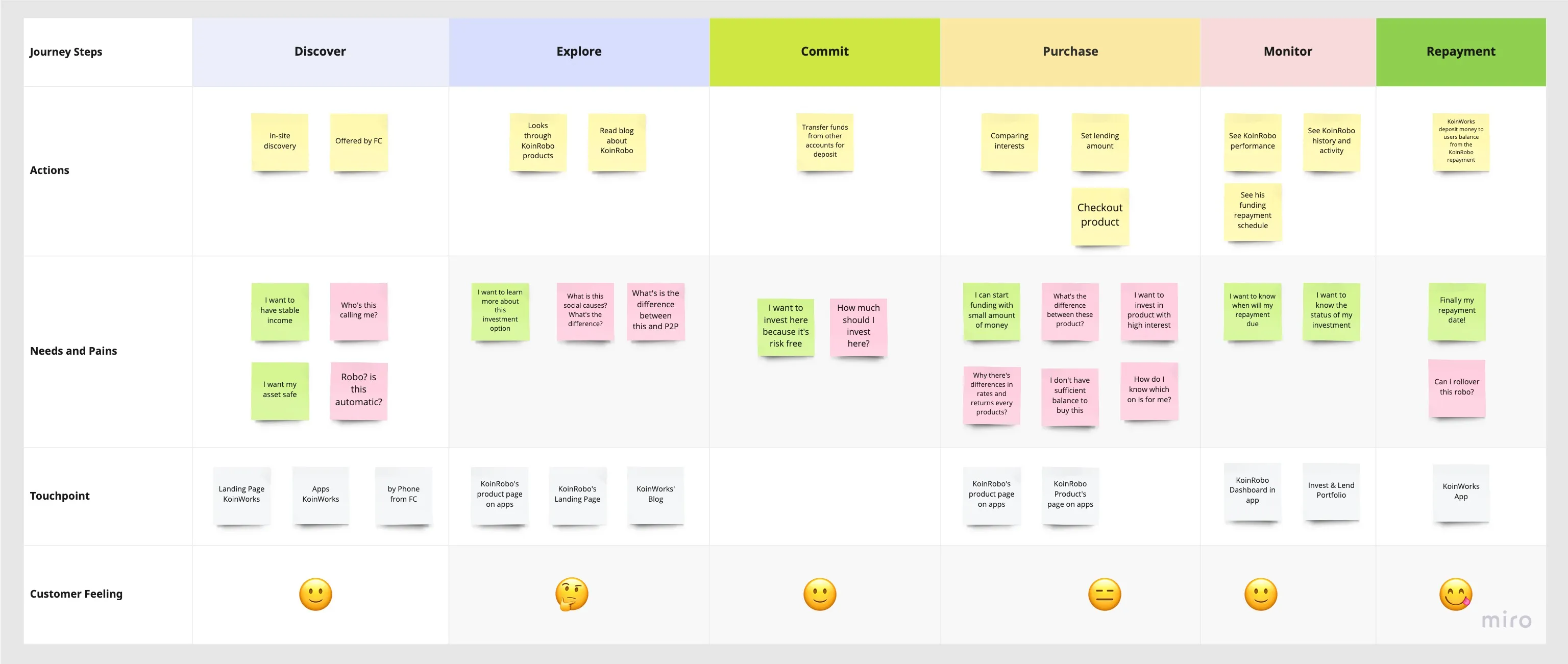
Where the problems are.
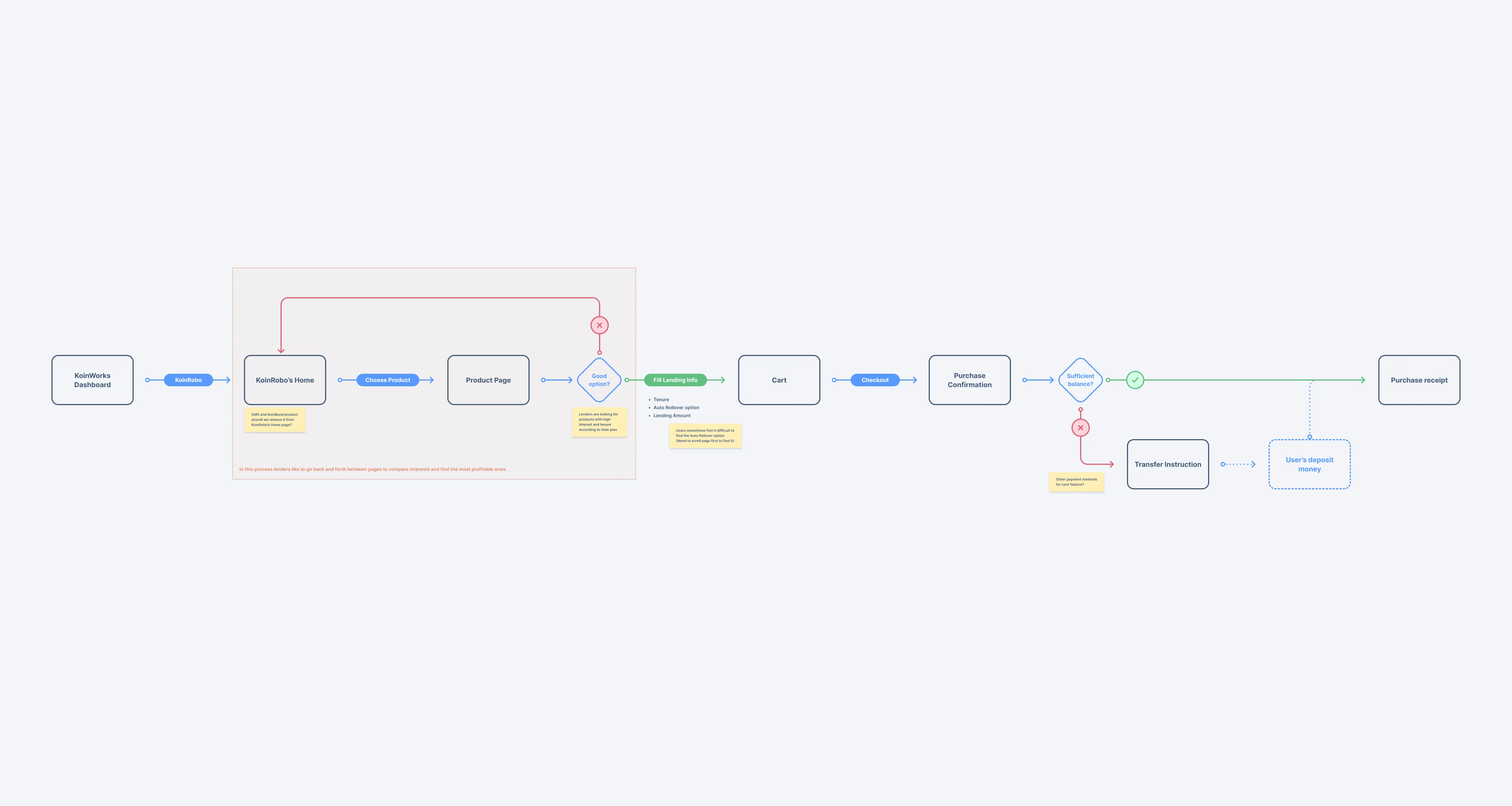
From KoinRobo’s task flow I could see the bigger picture of where problems occurred during the product purchase process.
How might we help lenders pick a KoinRobo product easier so they can get a return that matches their investment plan while also contributing to society?
After a brainstorming session with my product manager, four ideas rose to the top:
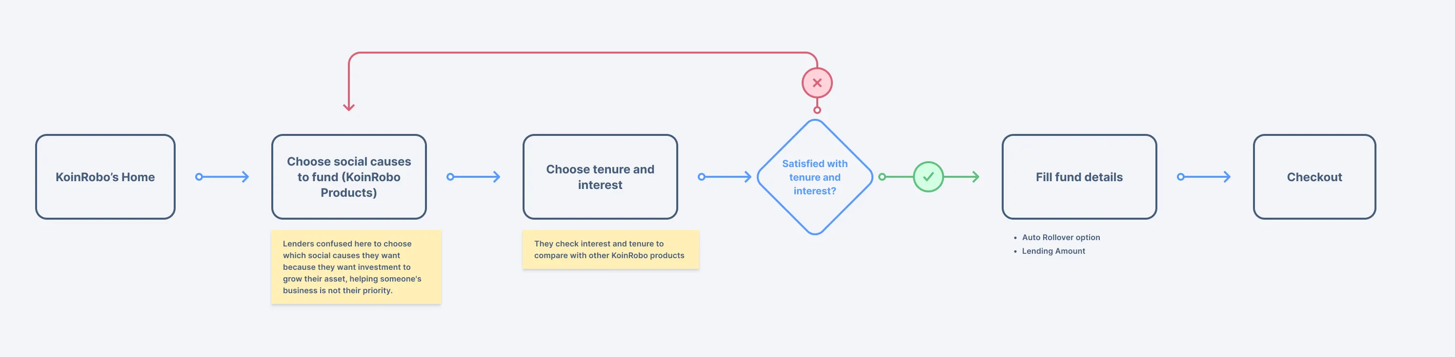
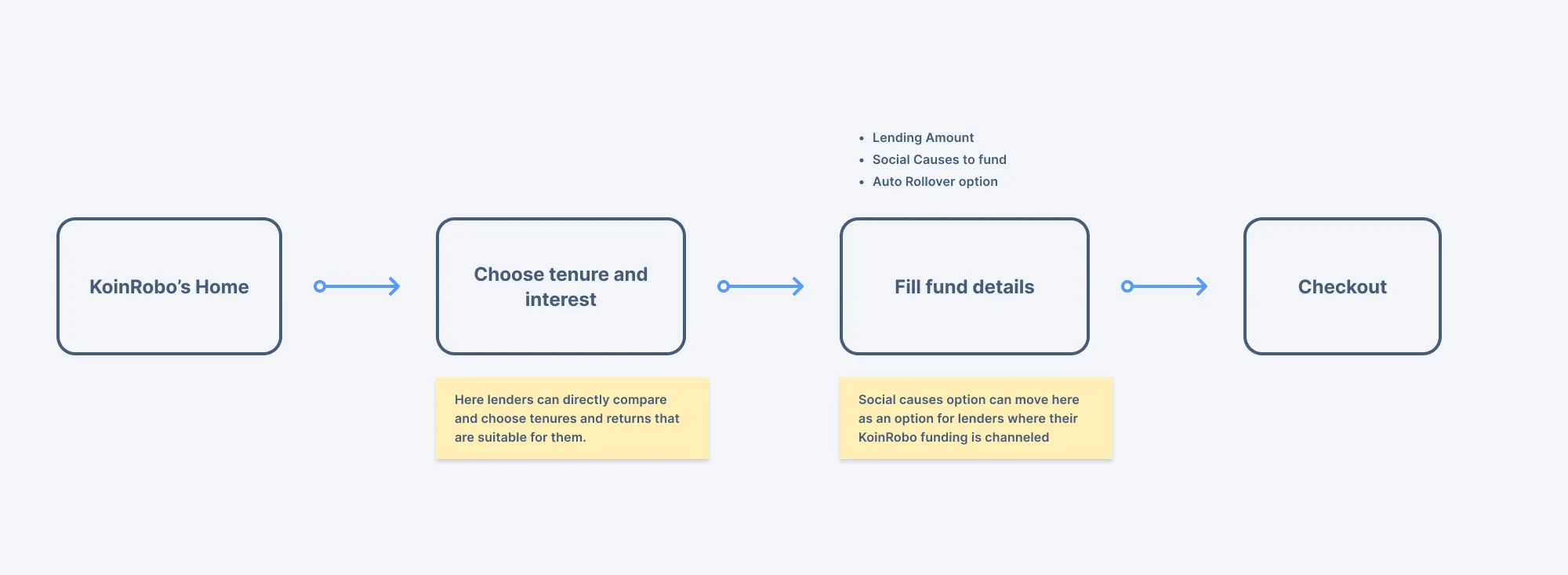
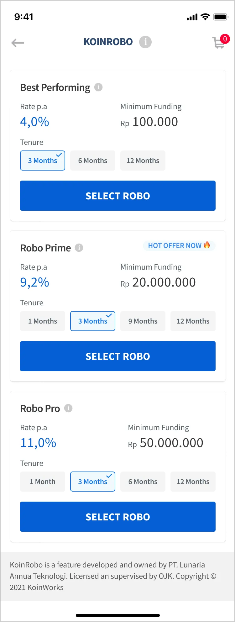
- Display all tenure and returns upfront. Lenders can choose the return and tenure they want before filling in the lending amount and social impact option.
- Make social impacts a latter option. Social cause selection can move after lenders have chosen their rate and tenure, preserving the brand value without blocking the purchase decision.
- Labels for product recommendations. Add labels to help lenders spot best-selling products or products currently on promo.
- Categorize products by minimum purchase. Simplify selection by grouping products by minimum purchase requirement.
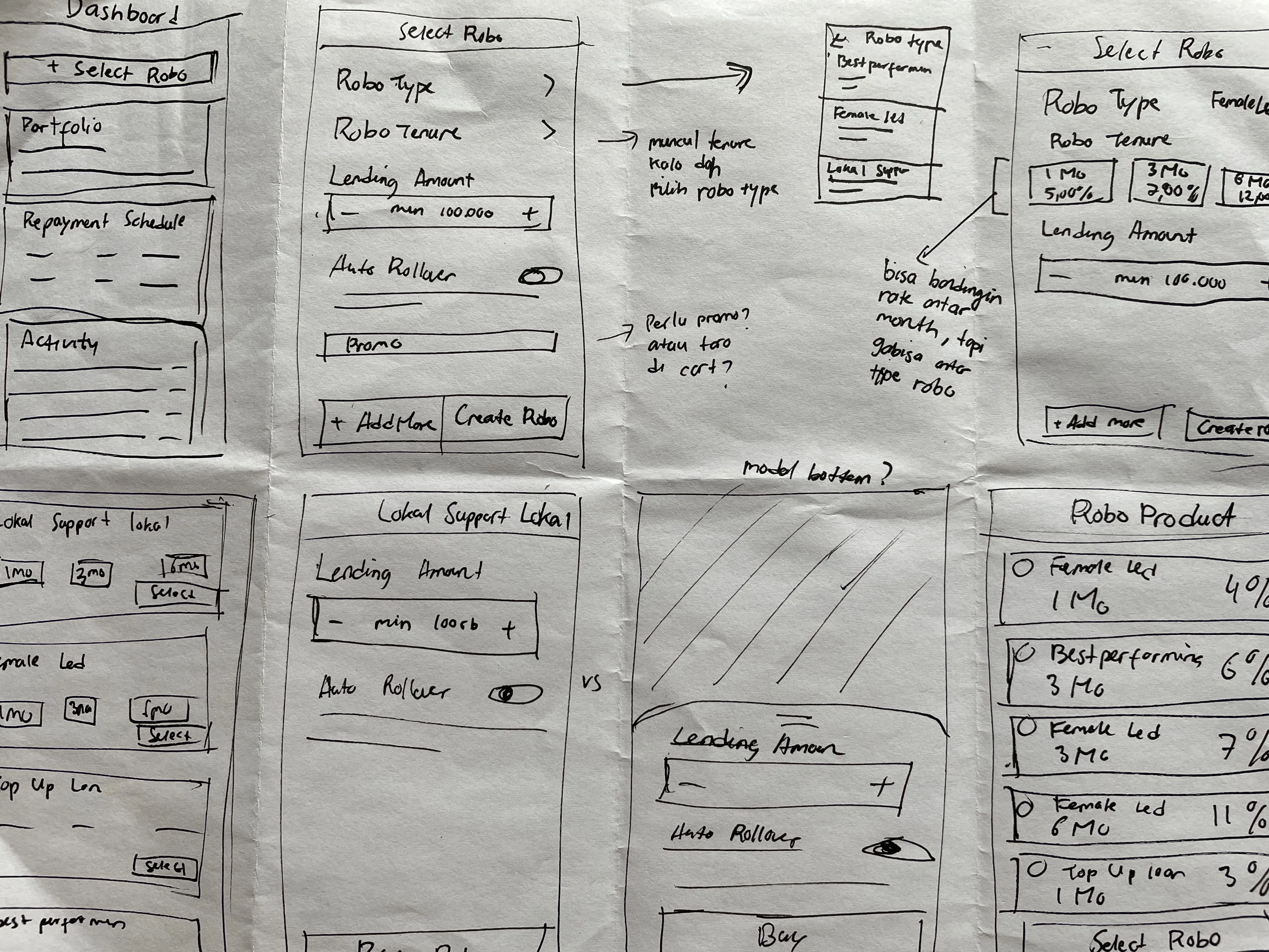
Sketching and Wireframing
I used pen and paper sketching and wireframing to explore potential layouts and flows for the KoinRobo products page.
UX Audit
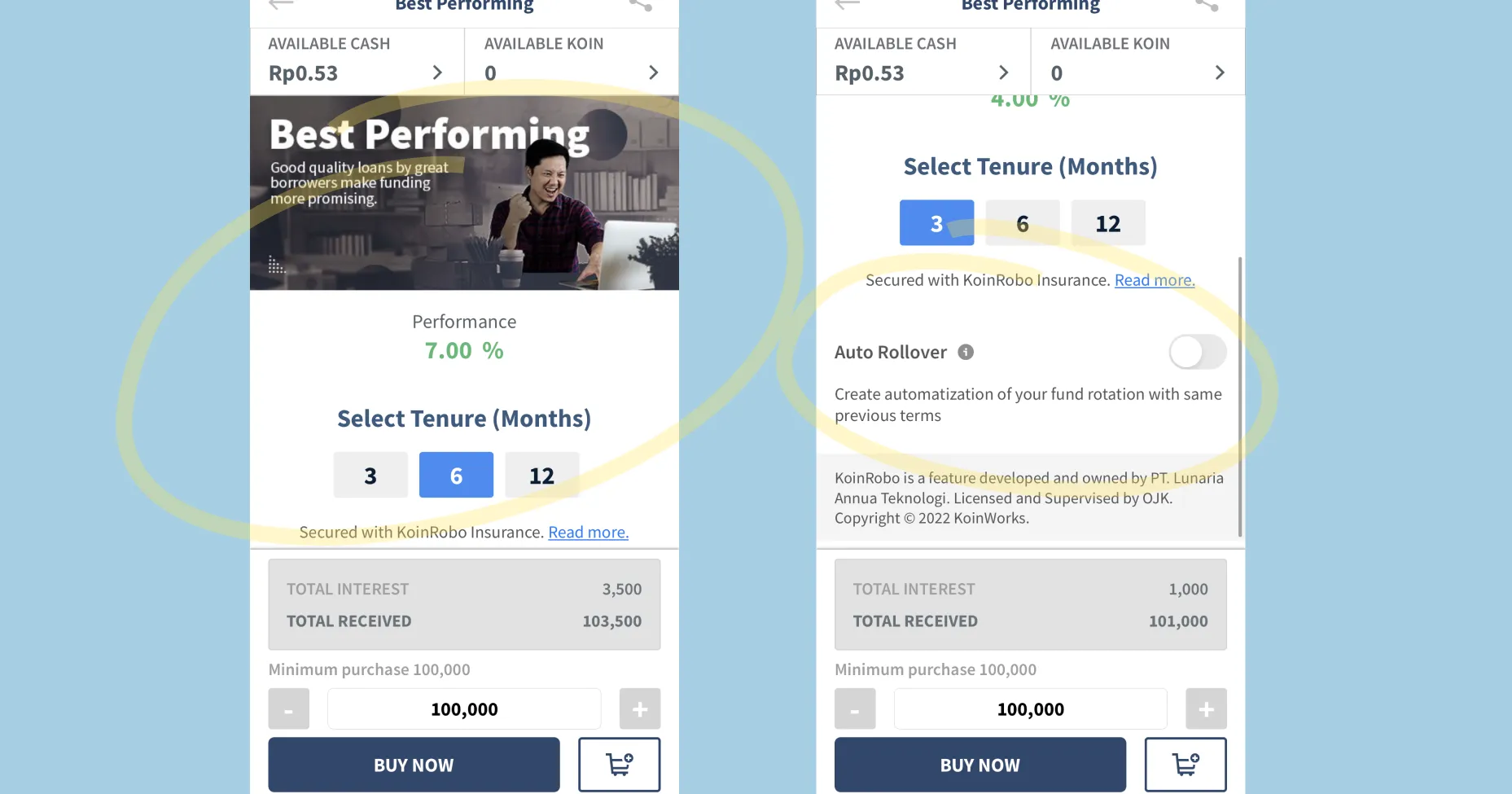
Interest Rate Disparity
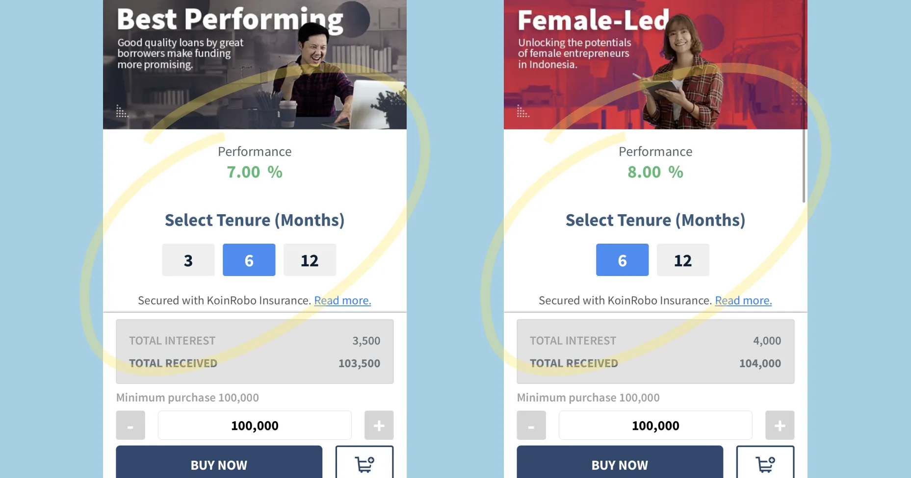
Each social cause product had different tenures and returns. Lenders had to switch between product pages just to find the most profitable option, there was no side-by-side comparison.
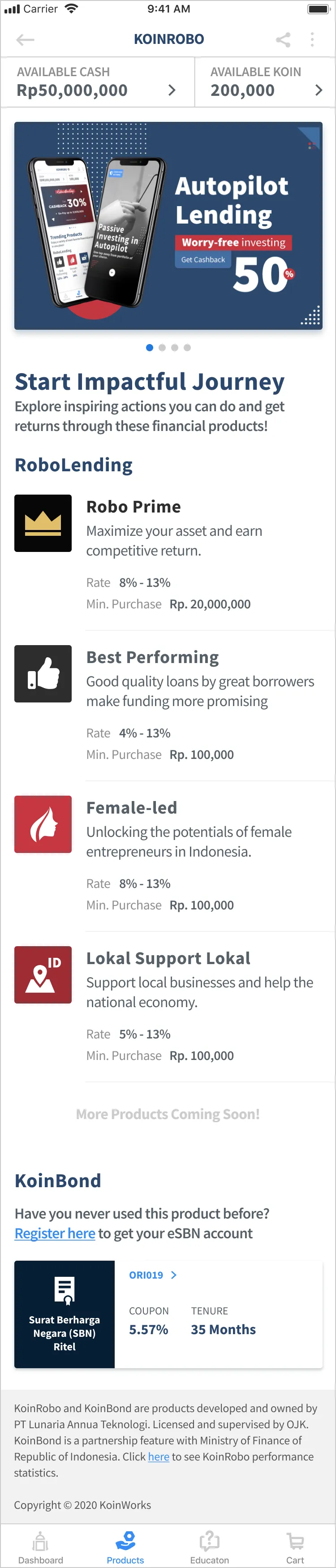
CMS Placement
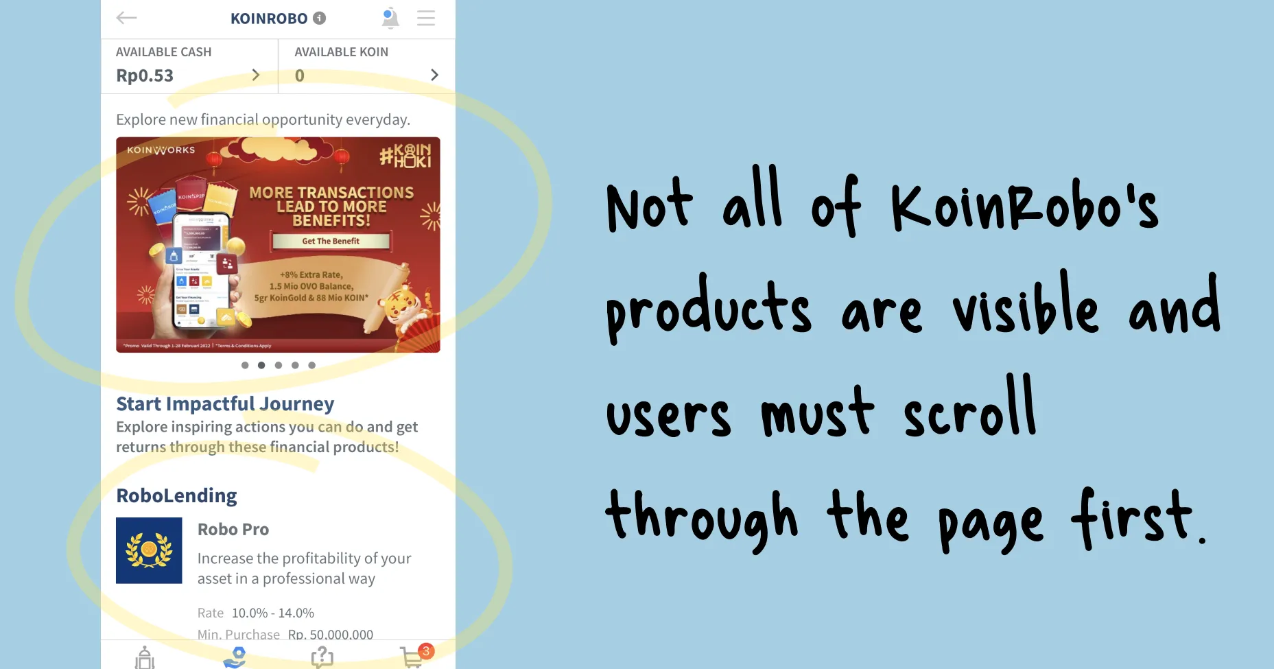
The CMS section took up a large portion of the page at first glance, pushing the KoinRobo products, the primary goal for lenders, below the fold.
Limited Viewable Content
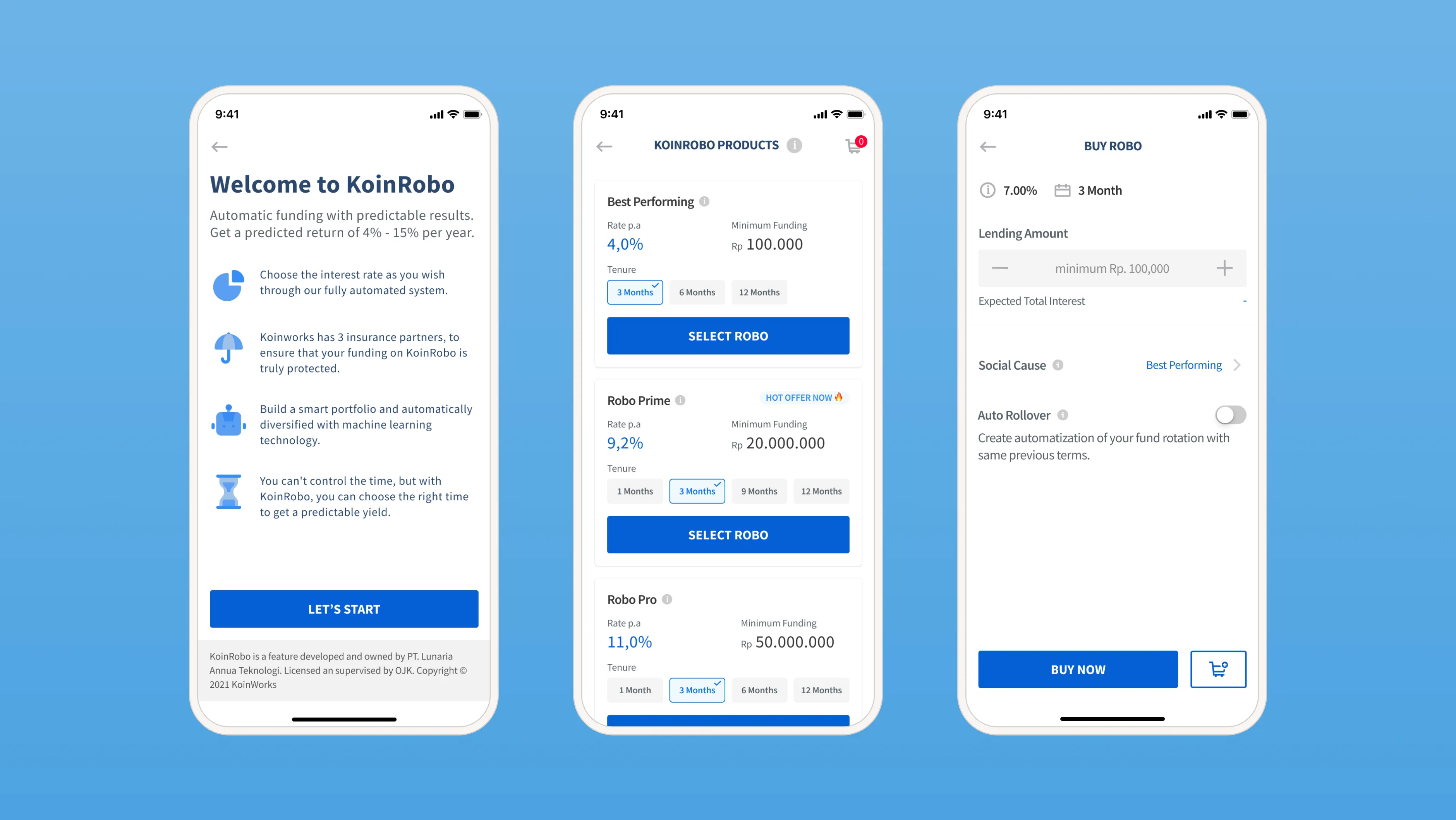
The banner and a fixed lending amount section at the bottom limited the viewable area, making the Auto Rollover option hard to find.
Product Inside Product
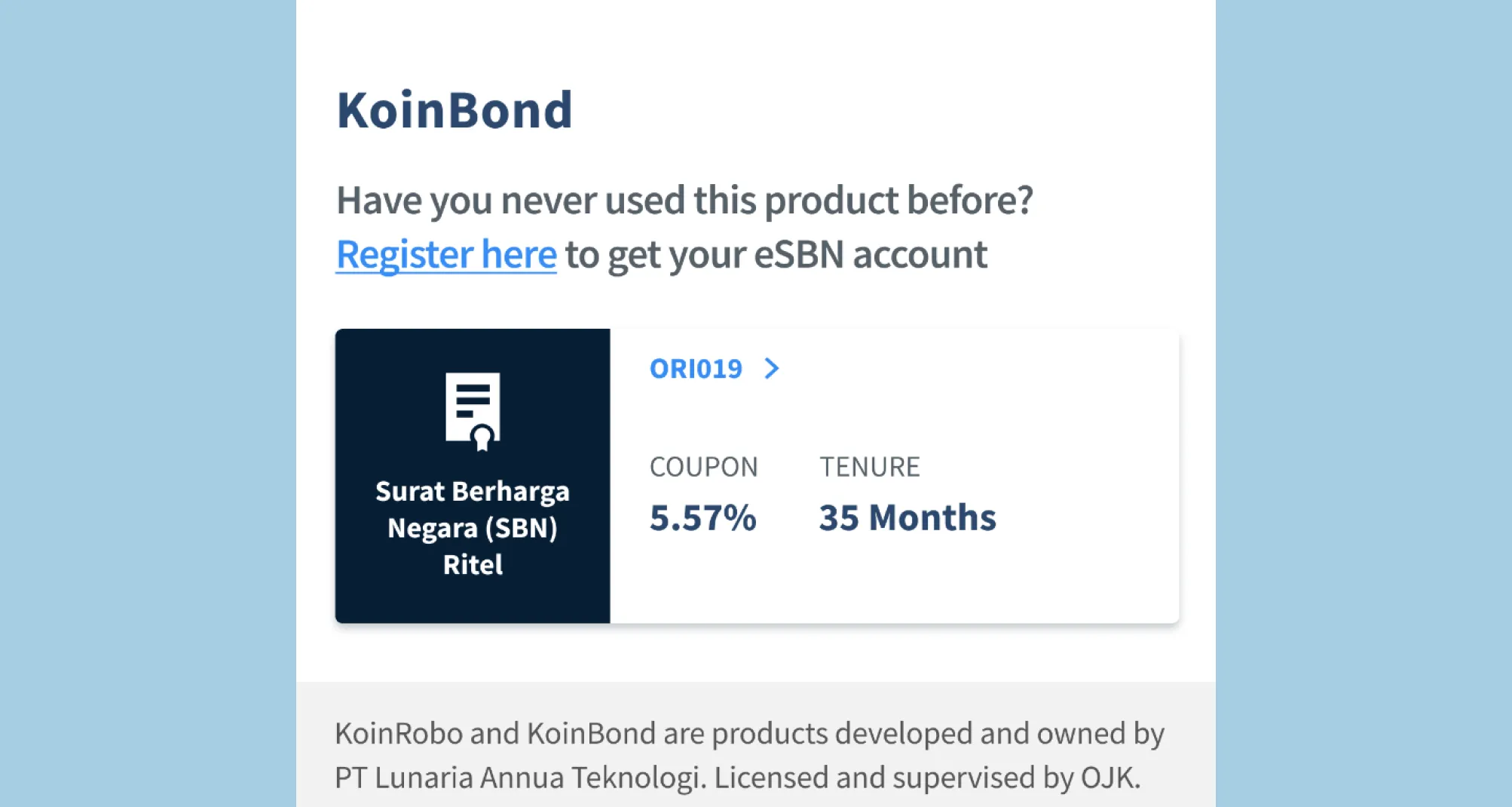
KoinBond, a separate product, was placed inside the KoinRobo page. It belongs on the main investment page, not nested here.
Proposed Design
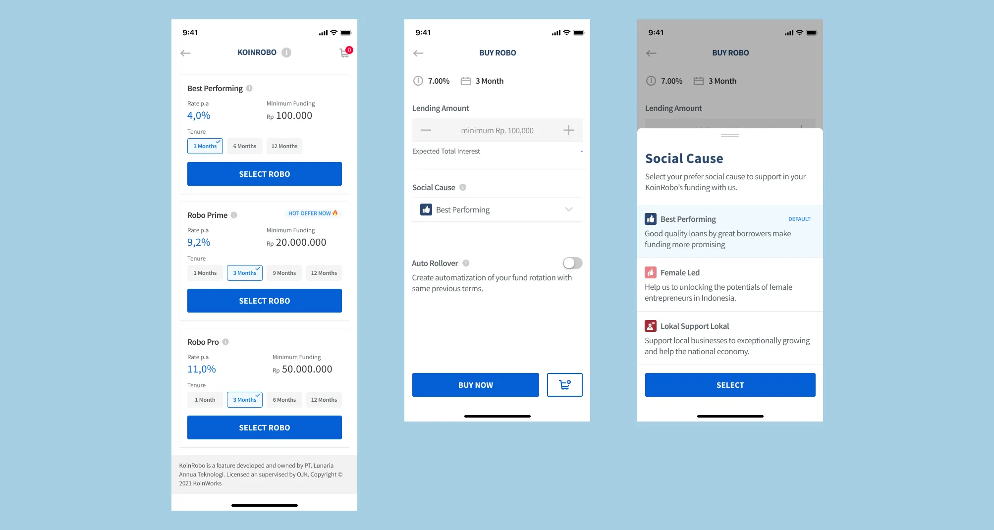
The proposed design introduces two key changes: product categorization by minimum purchase, and rate and tenure selection upfront.
Pain points
Lenders struggled to choose the right product because social impact selection was shown first, not their priority.
Design decision
Simplify page to let lenders focus to compare and choose the right product for them by displayed the tenure and its rates upfront. I also add label in products to help lenders choose product that best seller or currently on promo.
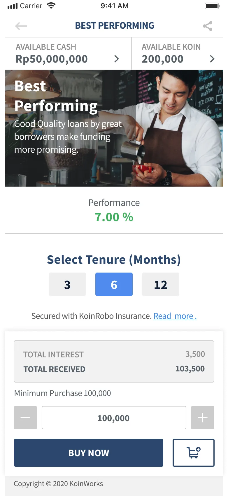
Pain points
Lenders have limitation view of the content because of the banner and the fixed bottom section of lending amount and lending detail.
Design decision
More clearer page by decluttering unnecessary content so lenders can view all information in one page. The social cause option is moved here so lenders can choose their social cause freely with the rate and tenure that they already chose before.
After creating the proposed design, I validated the solution by conducting usability testing and follow-up interviews with 9 lenders to gather qualitative and quantitative data.
Research findings:
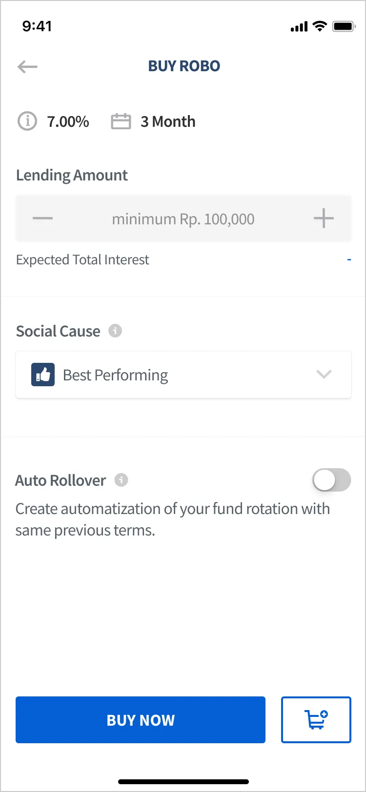
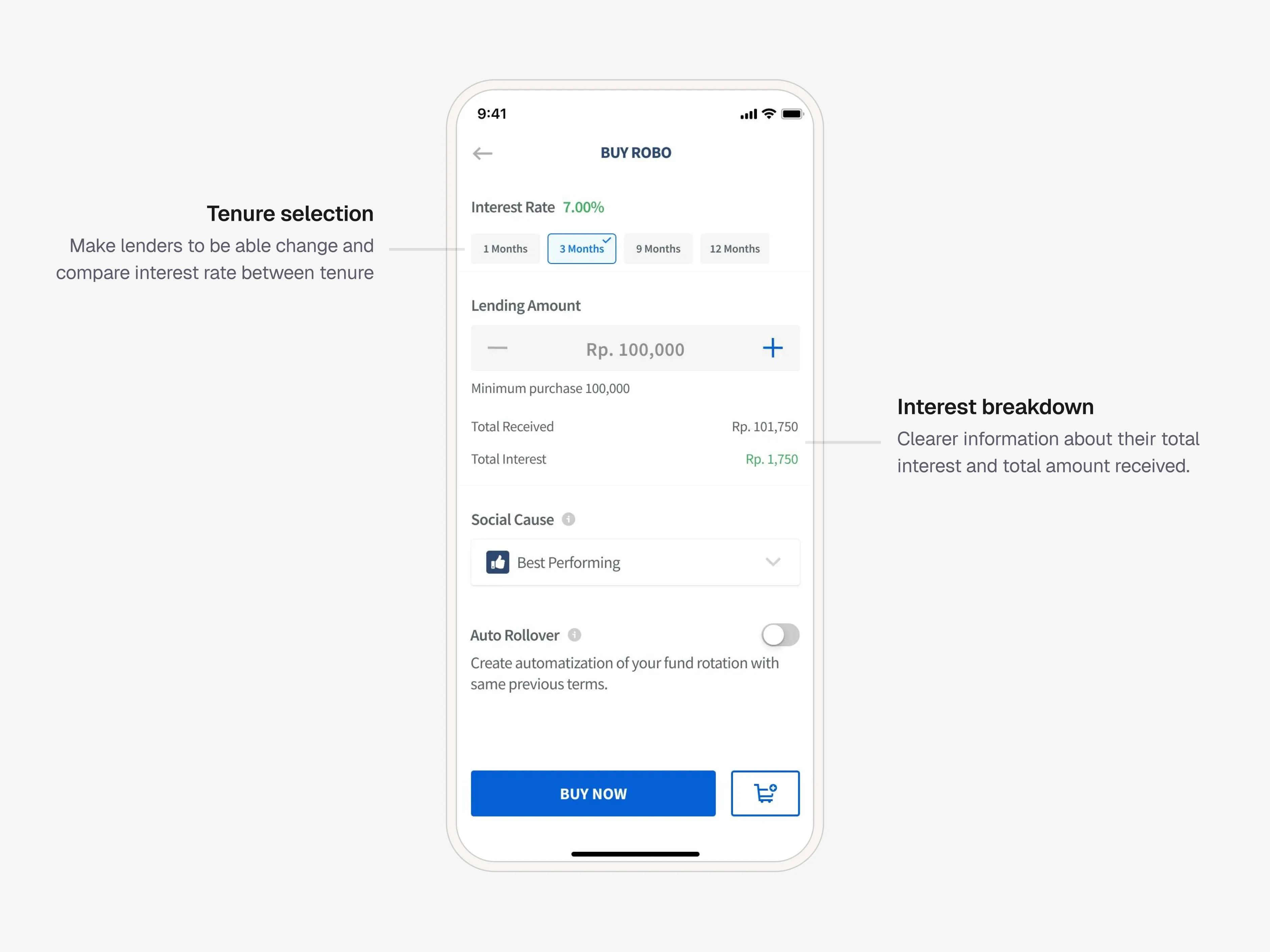
- Lenders who wanted to change the selected tenure when entering the Buy Robo page now had a clear way to do so.
- Lenders wanted clearer information about their total interest and total amount received.
- Lenders found the Auto Rollover option more visible.
- Lenders could now choose the social cause they genuinely care about, without having to juggle rate and tenure decisions at the same time.
Task Success Rate
+6.2%
Time on Task
16.7% faster
Iteration
Based on lender feedback, I made further refinements. Lenders still wanted to be able to change their tenure before confirming the purchase. They also needed clearer information about total interest and total amount received. I added an inline tenure selector and a full interest breakdown directly on the Buy Robo page.
What could be improved for next iteration
Next steps:
- Track business metrics, conversion rate and abandonment rate to validate the redesign’s impact on KoinRobo’s business performance.
- Explore the experience for lenders who want to purchase multiple KoinRobo products in one session.
What I learned:
- Don’t be afraid to take the initiative to research a design problem and bring it to stakeholders, the best projects sometimes start from a personal pain point.
- Getting research participants is easier when there’s an attractive reward, plan for this early in the project.
- Always find the balance between user goals and business goals. Social cause selection mattered to the business even if lenders deprioritized it, the solution had to accommodate both.